Addison-Andover Museum
Website Design
Approximately twelve shows, including permanent collection installations and major traveling exhibitions, are carefully balanced to represent a wide range of art, across time and media.
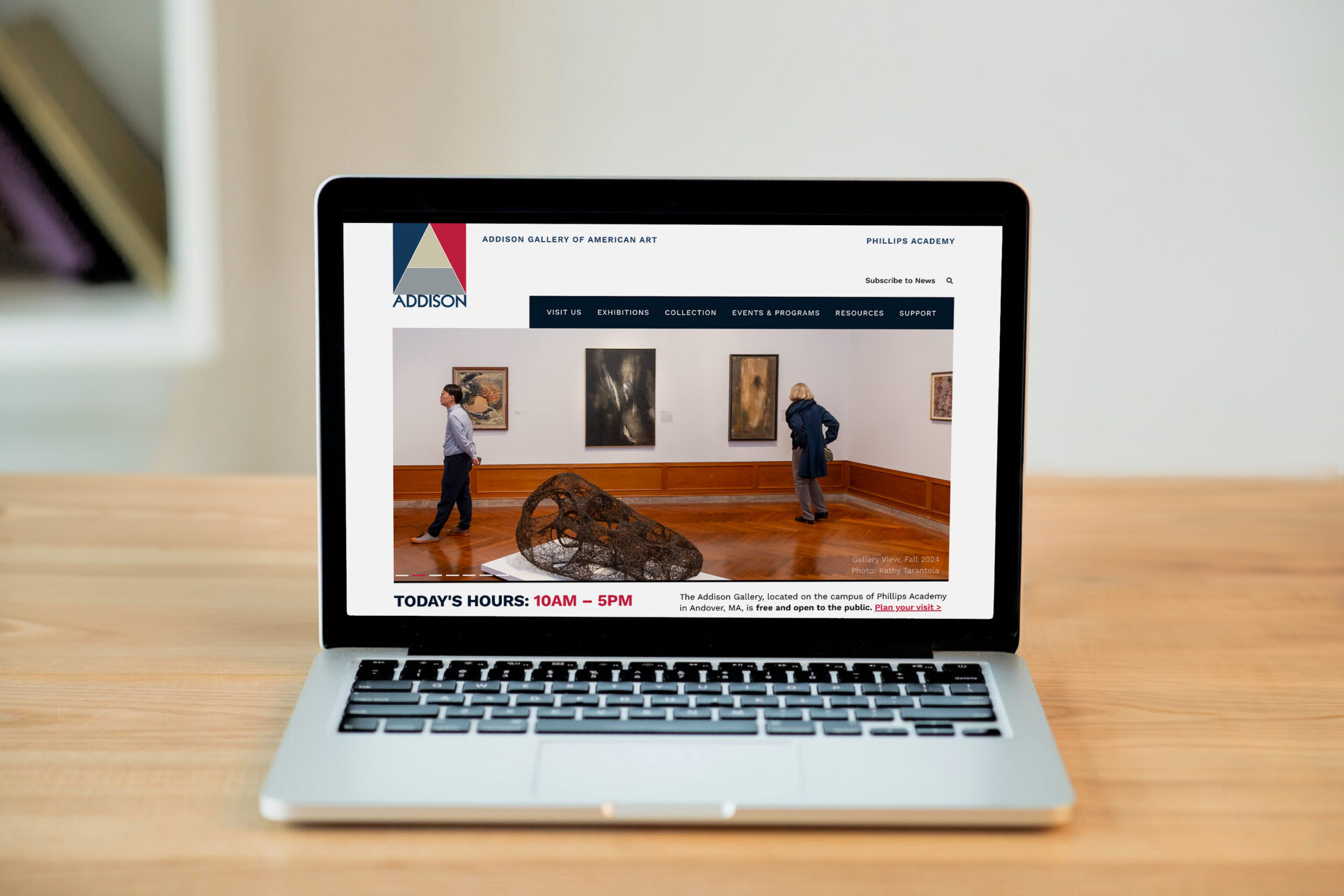
The new brand’s new identity ignited the opportunity for the museum to revisit its online presence. Brand workshops provided an understanding of how the client envisions the museum collection in the museum space.


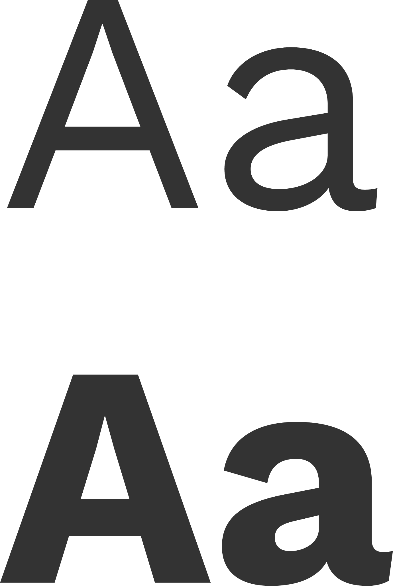
Work Sans Font
The Modern Grotesque font Work Sans served as a strong foundation for the website with its geometric aesthetic, rounded corners, and uniform strokes. Its clean, versatile simplicity suits digital interfaces ensuring content remains the focus. Designed for screen optimization, it offers high legibility at small sizes, generous spacing, and balanced letterforms, making it ideal for body text and clear even on low-resolution displays.
Component Sprints
The Component Sprint closely examined the content from a UX/UI perspective. Layout, typography, buttons, links, and CTA patterns are tested across media widths, considering breakpoints and content flow. This process leads to a comprehensive understanding of how the content functions.


Theme Sprint
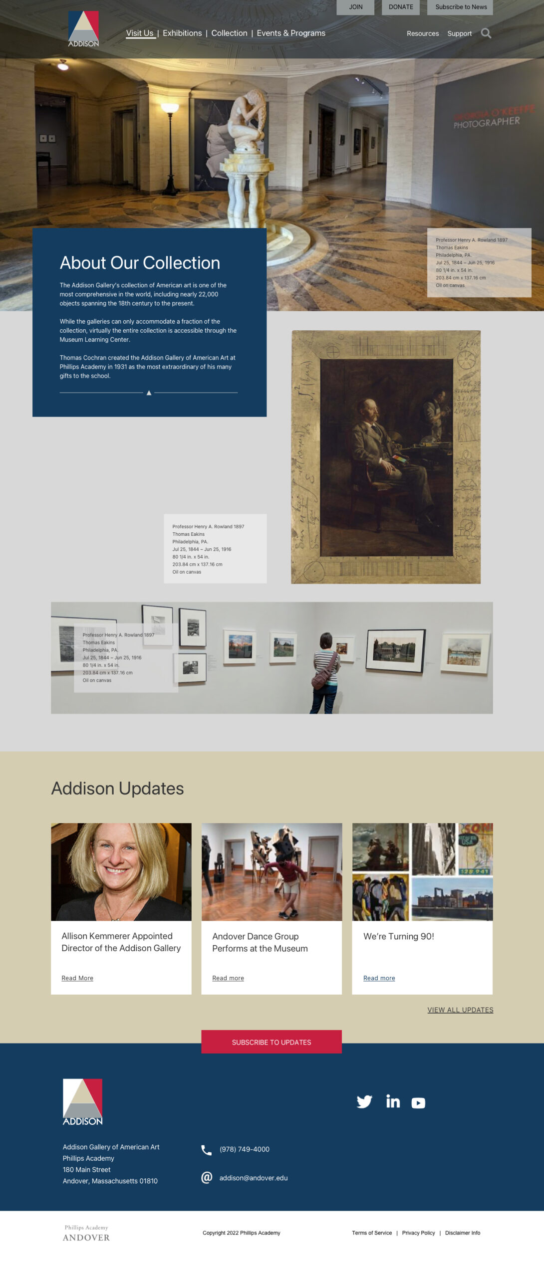
The homepage theme sprint quickly examines art components, the arrangement of text, and imagery. It also considers the storytelling flow, section rows, content groups, and visual style for impact. Design principles, such as hierarchy, contrast, rhythm, and movement, guide the layout.
Ideas presented opened up discussions around aesthetics, color, typography, layout, and structure, questions are asked and design decisions are rationalized.
The sprint process engages the client team and creates shared ownership where consensus and buy-in unfold.
Concept A

Concept B

Concept C

