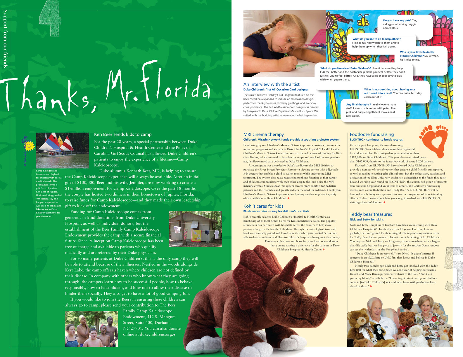
Duke Children’s Brand
Brand Identity
Print
Digital
Duke Children’s Stories branded the front of the newly formatted Duke Children’s newsletter. The Duke donor community enthusiastically welcomed its first mailing, which reinterpreted the newsletter. The brand offered a cohesive design format, an efficient mailing vehicle, and visually compelling artwork for donor communications.
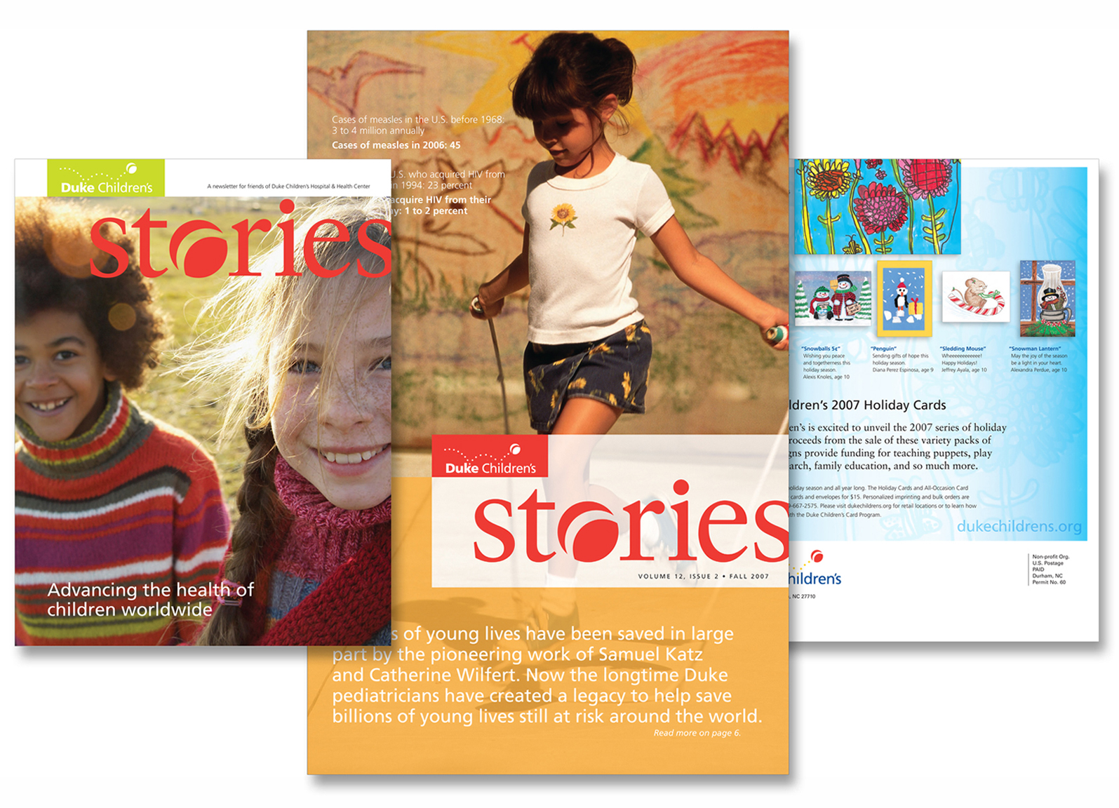
Inside Content
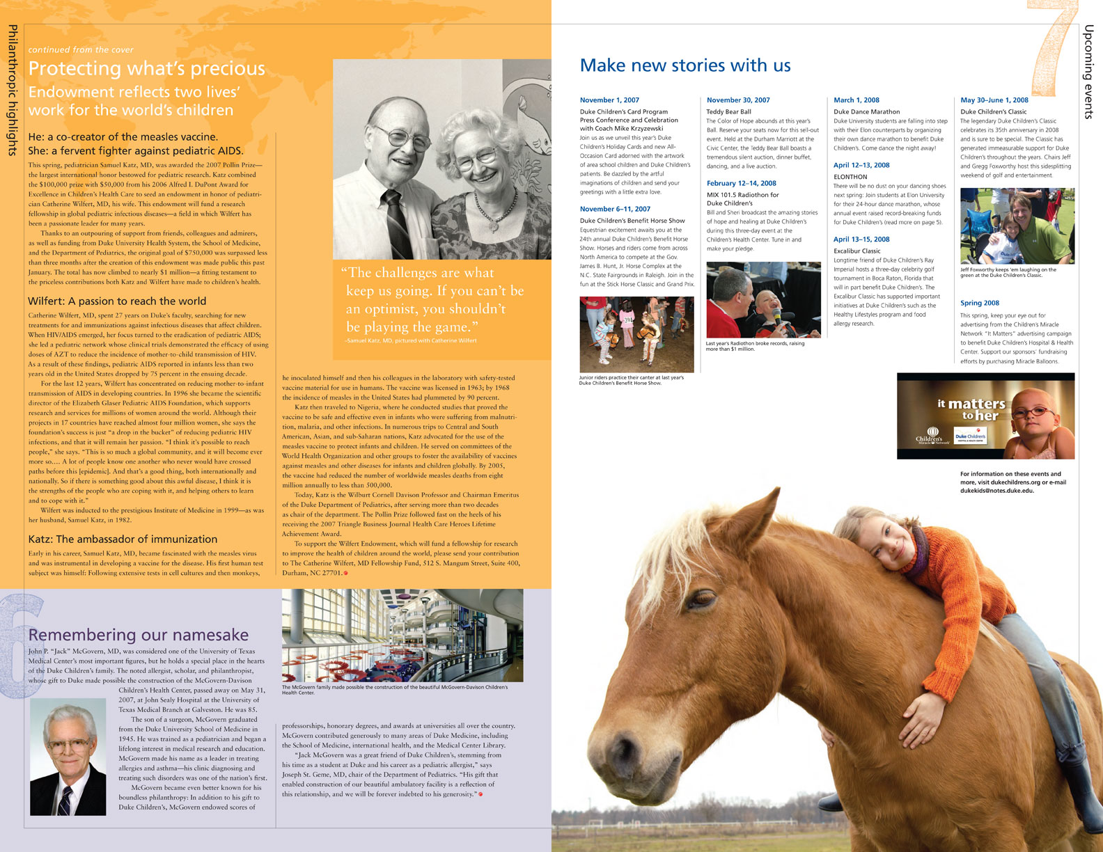
The design language responded to the larger 11″ X 17″ format with dynamic imagery, fields of color, and interesting touches of typography—the bold design and immersive format engaged the donor community.
Duke Children’s Print
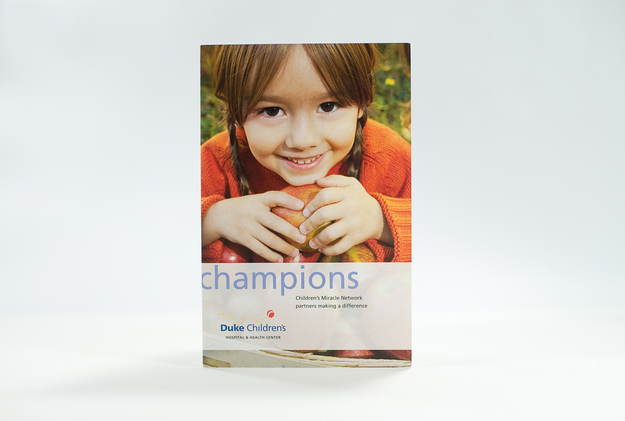
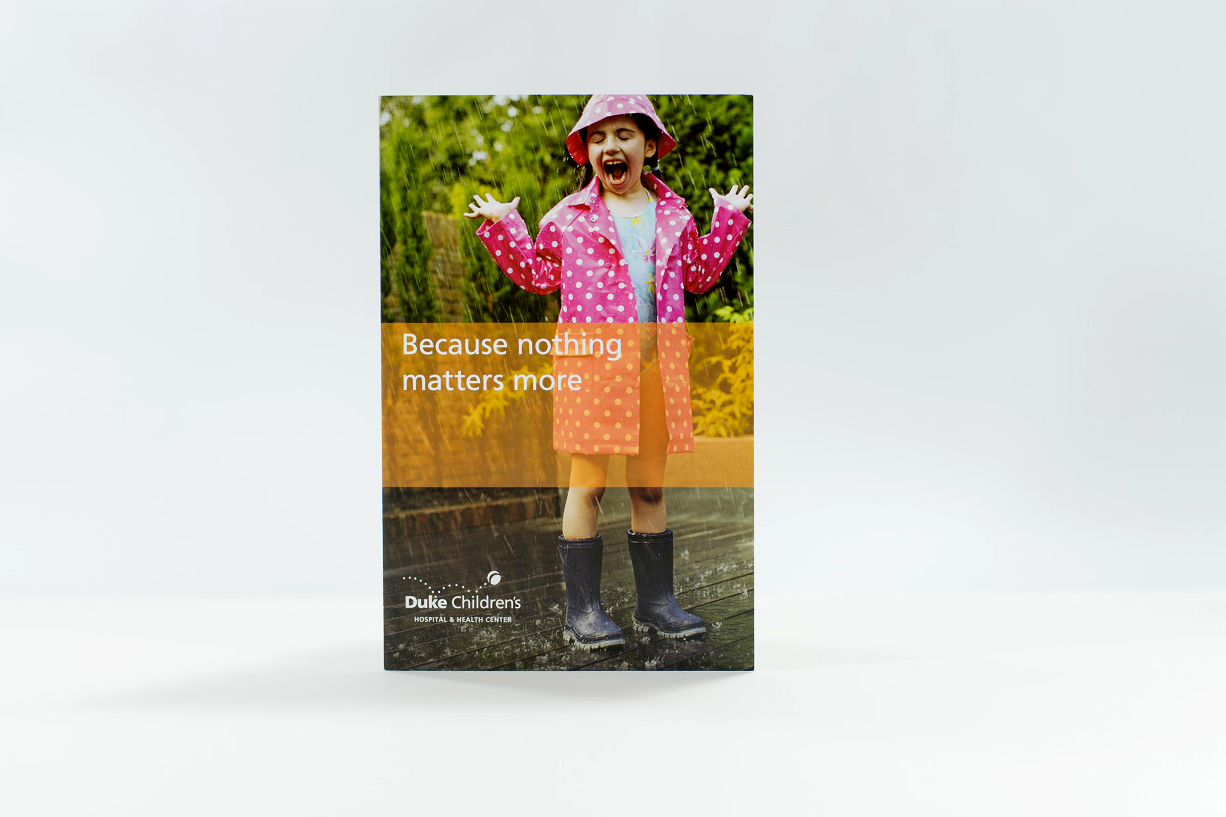
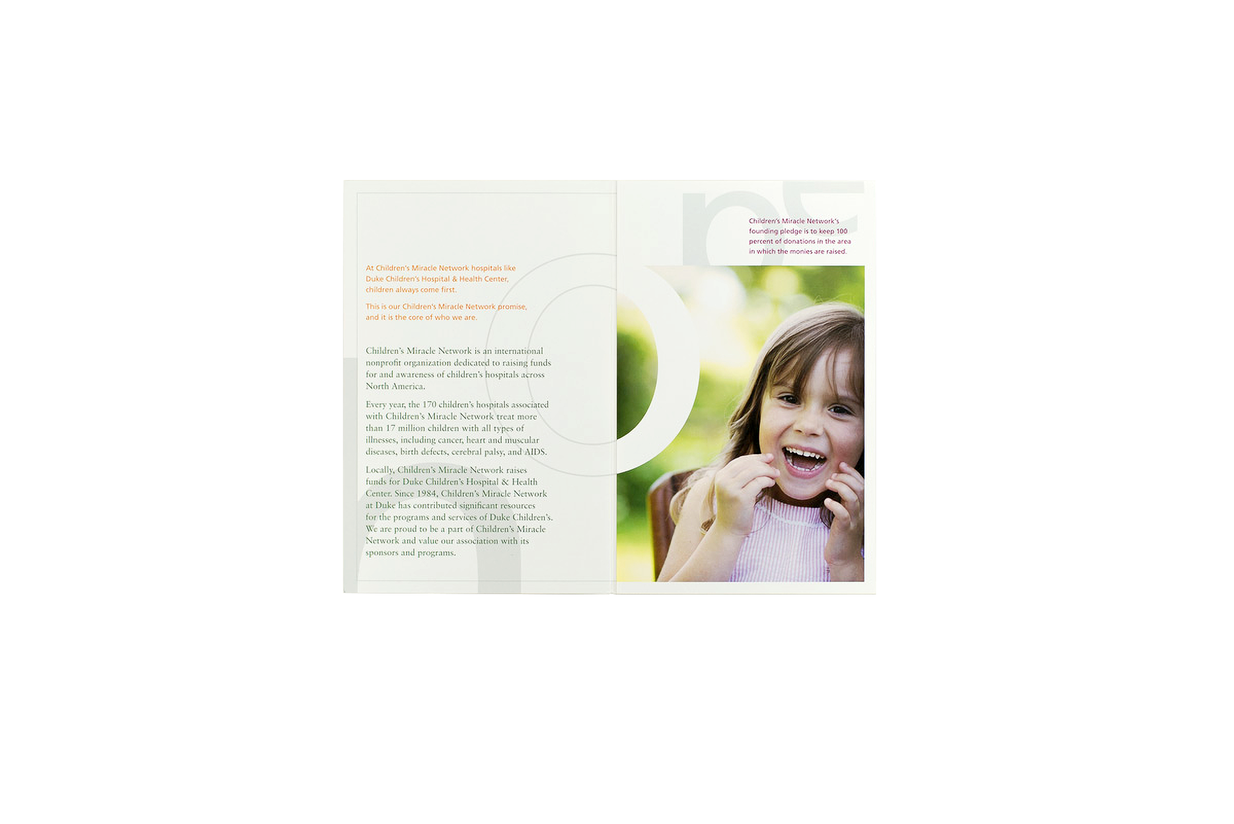
In efforts to update donors, a 5.5 X 8.5, tri-fold brochure mailer describing the important ways Children’s Miracle Network at Duke Children’s is being supported in its growing initiatives, and how gifts are used to help children’s illnesses for today and tomorrow.
Departmental Newsletter
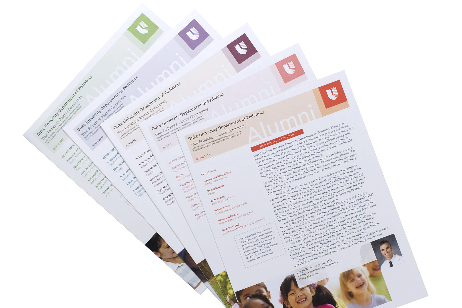
Following the new design of Duke Stories publication, the Department of Pediatrics wanted to relook at its design. With consensus and buy-in from the leadership, the new design language spilled into many communication tools.
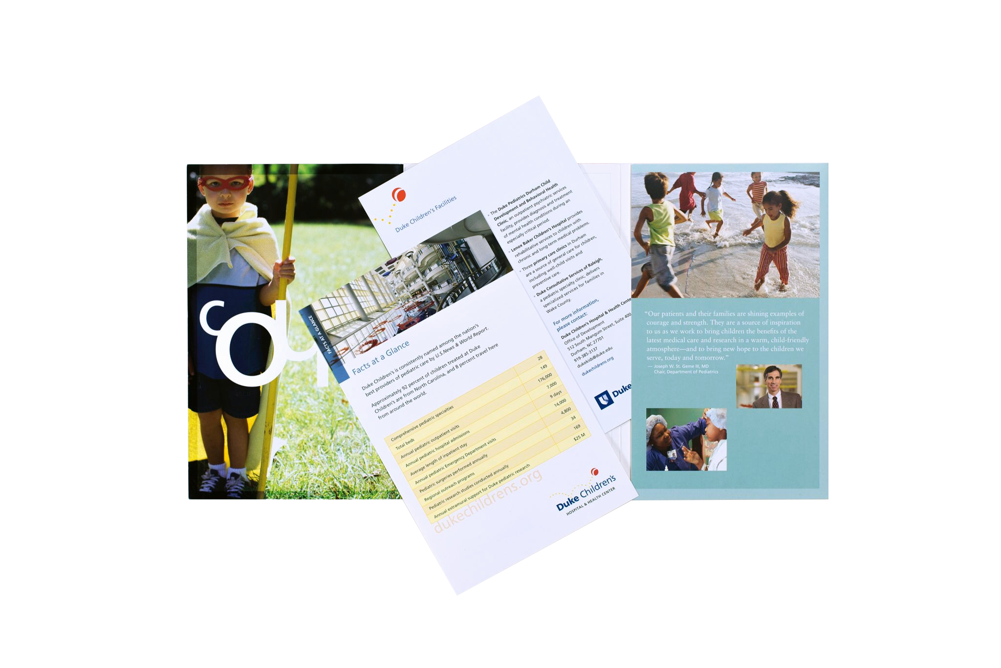
Annual Donor Brochure
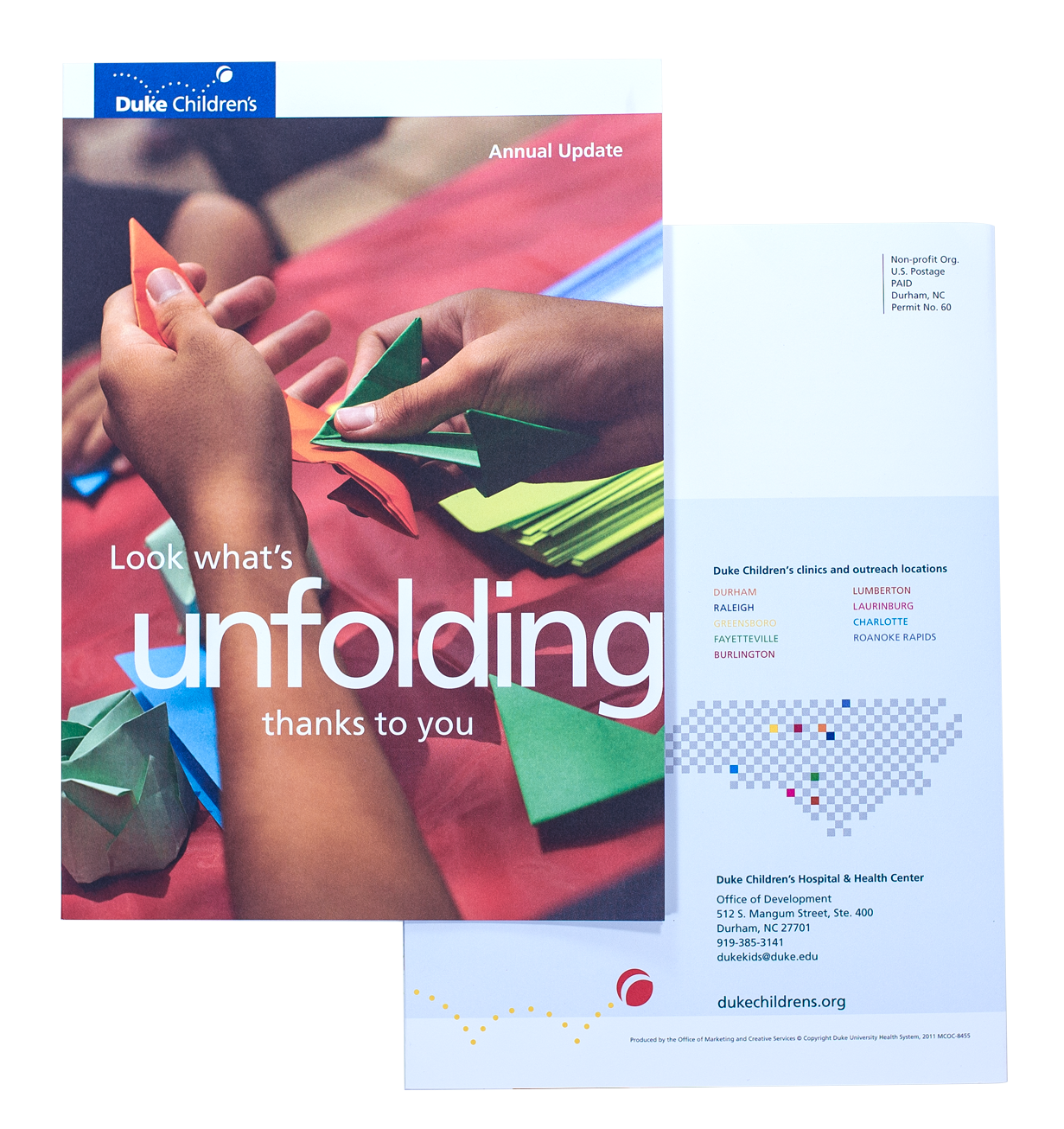
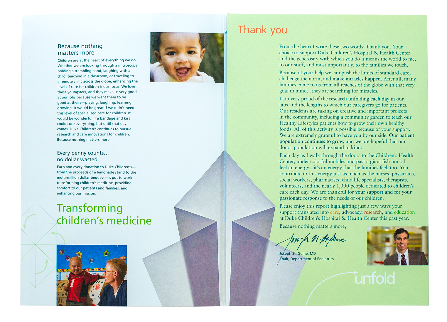
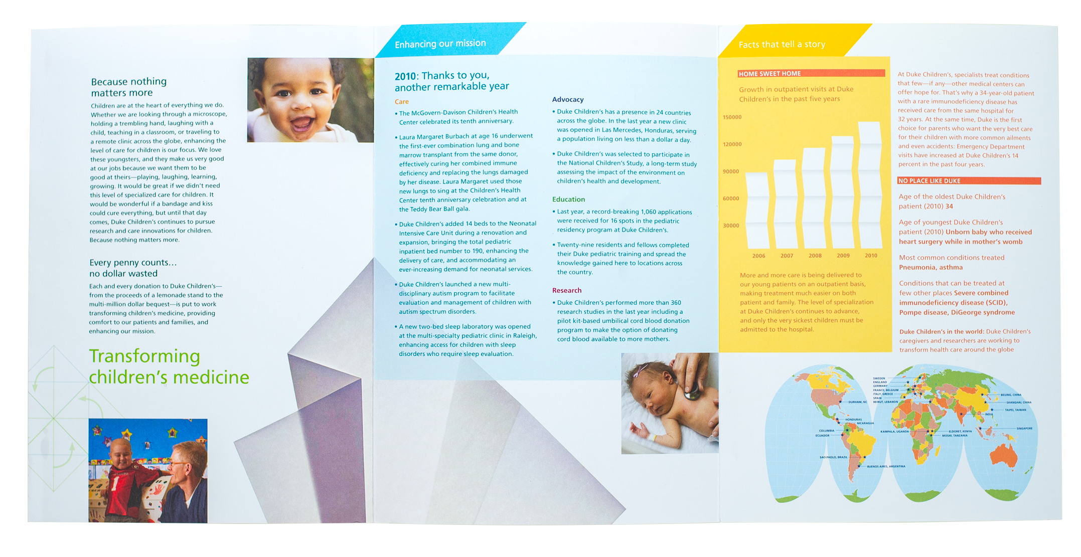
The tri-fold brochure illustrates the impact of the new Duke Children’s brand using large fields of color, engaging photography, informative charts, and graphs.
