Duke University Event
Materials
Branding
Print
Environmental
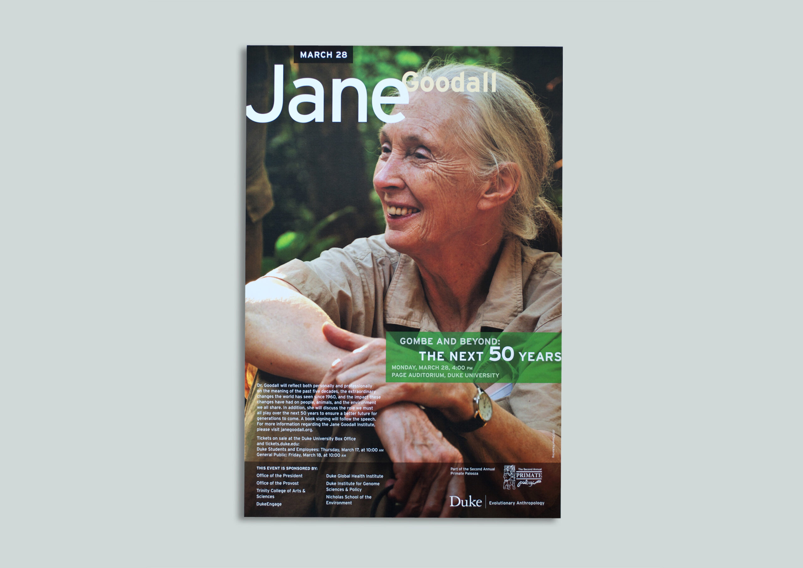
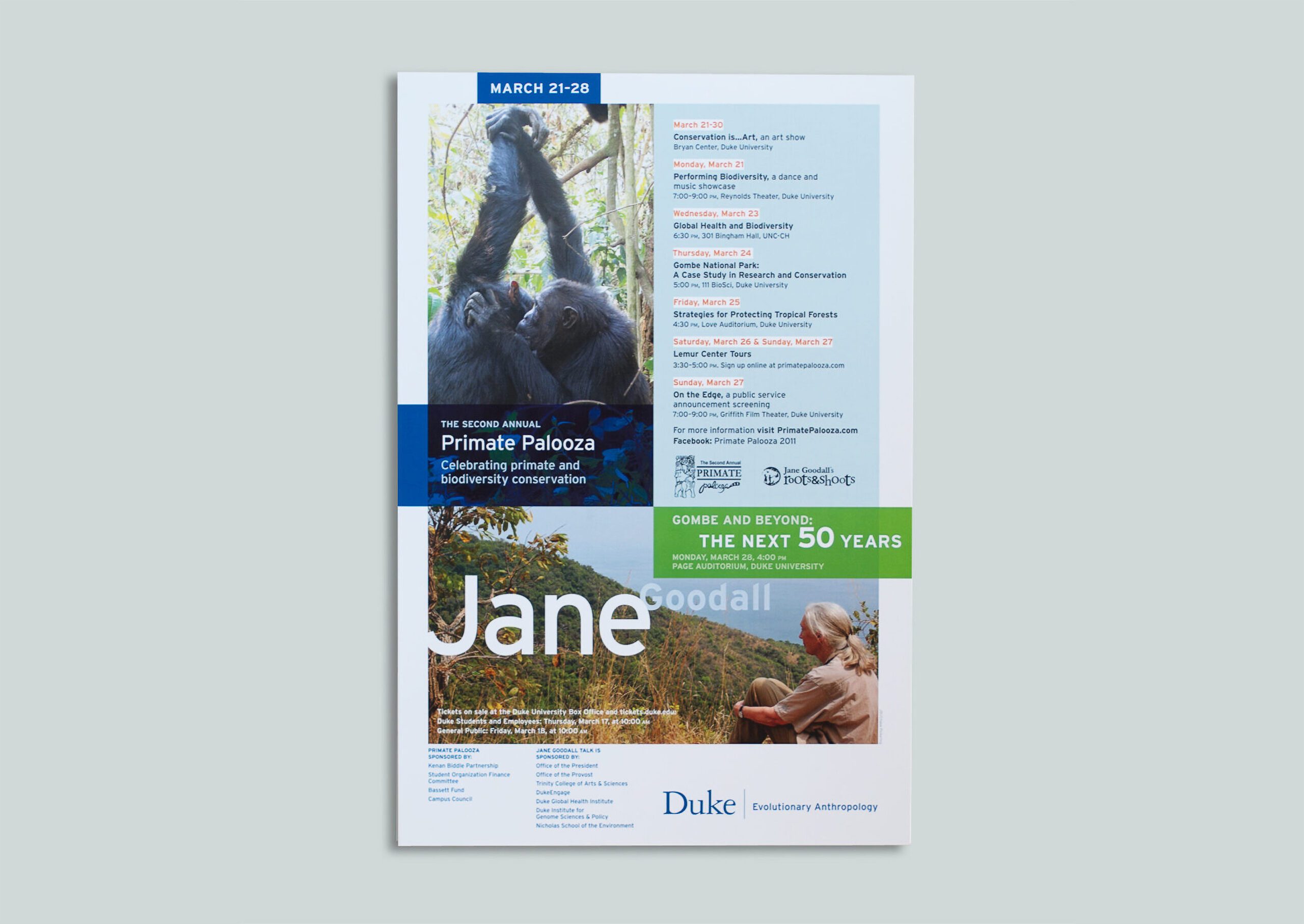
Posters flooded Duke’s Campus announcing the week’s events for The Primate and Biodiversity Conservation. The celebration was filled with art exhibits, performances, case studies, tours, talks, and discussions sponsored by Duke Evolutionary Anthropology and Jane Goodall’s Roots and Shoots program. The announcement of the new home for Jane Goodall’s 50 years of collected data on chimpanzee behavior marks the beginning of the next 50 years at Duke’s Jane Goodall Institute Research Center.


Duke University Provost
Lecture Series
Print
Digital
Environmental
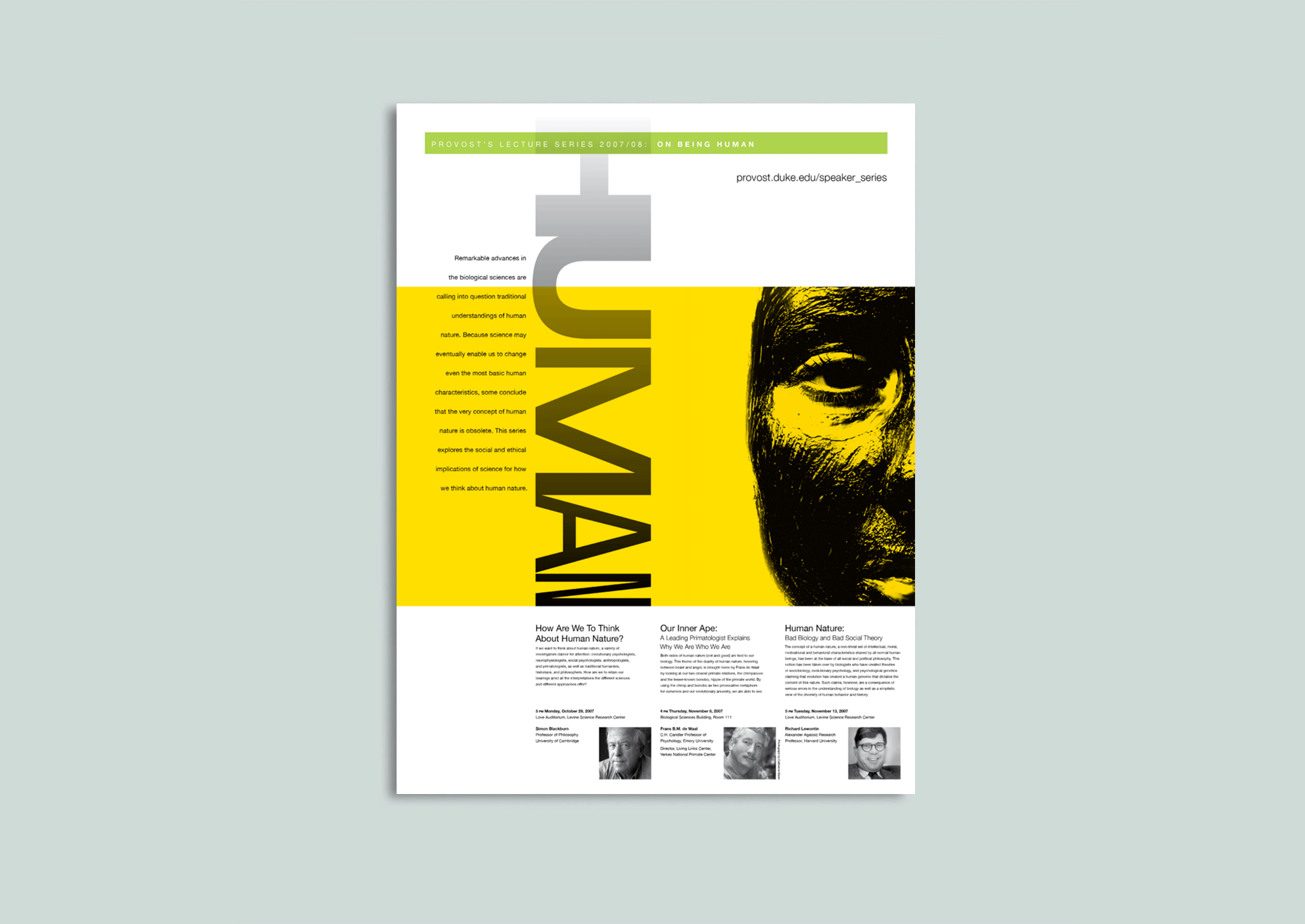
What is it to “Being Human”? Duke University’s office of the Provost sponsors a bi-annual series of presentations and panel discussions about current topics of interest. A theme graphic was created to unite a variety of communications in promoting this sponsorship. Posters, flyers, campus advertisements, web banners, and bus line graphic materials were created to push communications.

Color themes were used to announce a new speaker during the series. Black and white ads and horizontal banners are presented online and in bus interiors.

The Magic of Medicine
Print
Book Design
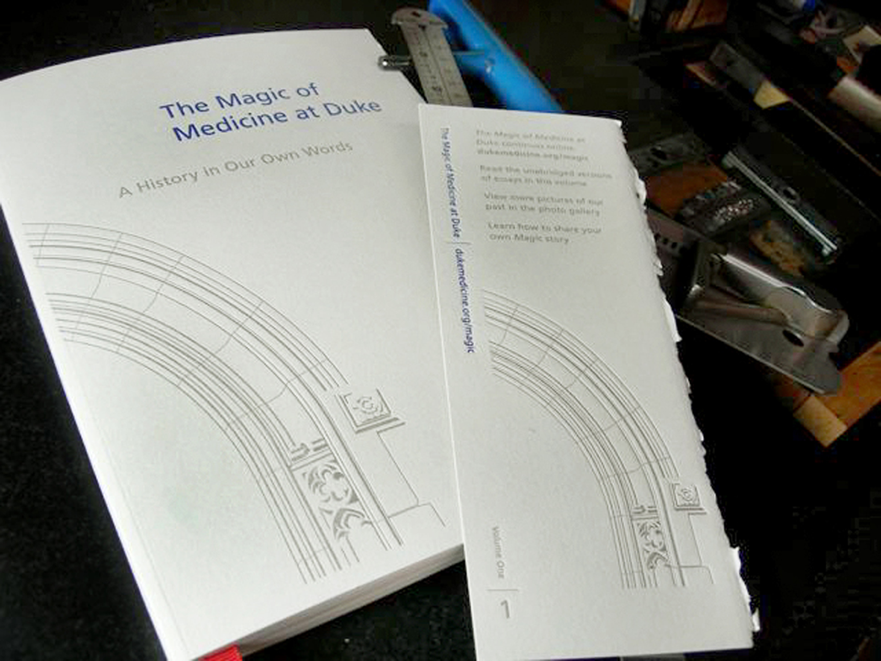
A one-of-a-kind project to document the voices of Duke Medicine’s past, The Magic of Medicine at Duke is a collection of narratives — ranging from brief anecdotes to in-depth accounts complete with citations — written by Duke alumni, faculty, staff, and friends. The volume seen here is a collection of highlights recounting “The Medical School Experience,” “Making Medical History,” and “Leaders, Teachers, Mentors, Friends” at Duke Medicine.


The cover and bookmark feature a custom illustration of iconic Gothic architecture, inspired by landmarks synonymous with Duke University.
The cover typography utilizes Frutiger Roman, a humanist sans-serif typeface designed by Swiss designer Adrian Frutiger, chosen for its contemporary style and excellent legibility. The interior text is set in Sabon, a classic serif typeface designed by Jan Tschichold in 1967, offering a complementary balance to the sans-serif font.
The memoir was produced using letterpress, one of the oldest printing methods, originating in the 15th century with Johannes Gutenberg’s invention of movable type. The cover is printed on Rives BFK, a mold-made, 100% cotton-rag printmaking paper from Arjowiggins.
The interior text pages are printed on Mohawk Eco Varsity vellum, while the gallery section is printed on Sappi Lustro Offset Environmental paper. Both papers contain a minimum of 30% post-consumer recycled fiber, reflecting a commitment to sustainability.
