Duke Medicine
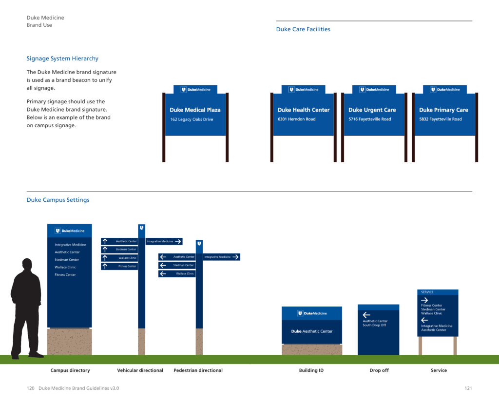
Environmental Signage
Print & Web Design
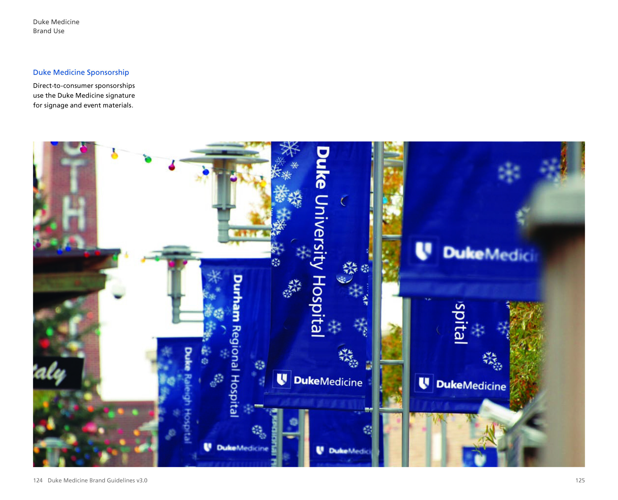
Advertising & Event Sponsorships
In 2005, the Duke University Health System (DUHS) underwent a rebranding to become Duke Medicine. This change aimed to better represent its integrated approach to healthcare, research, and education. The branding transformation was designed to unify its visual identity, enhance recognition, and strengthen its position as a leader in healthcare and research. The initiative focused on creating a cohesive identity that reflects Duke’s values of excellence, innovation, and patient-centered care.

Strategic Approach
The rebrand introduced a modernized logo system, refined typography, and an expanded color palette to maintain visual consistency across all communications. Special attention was given to accessibility, ensuring legibility and clarity in all digital and print applications.
Visual Identity
- Logo Evolution: A streamlined mark that maintains Duke’s heritage while enhancing scalability and clarity.
- Color System: A refreshed palette balancing tradition with vibrancy to convey trust and innovation.
- Typography: A refined type system that improves readability across various mediums.
Implementation & Impact
The brand was rolled out across signage, marketing materials, and digital platforms, ensuring a seamless transition. The result? A strong, unified identity that reinforces Duke Medicine’s leadership in healthcare.
Discover the complete branding process and its impact in the Duke Medicine brand guide.
Duke Medicine brand guide.

Select Pages from the Brand Guide