NC Rural Center
Website Design
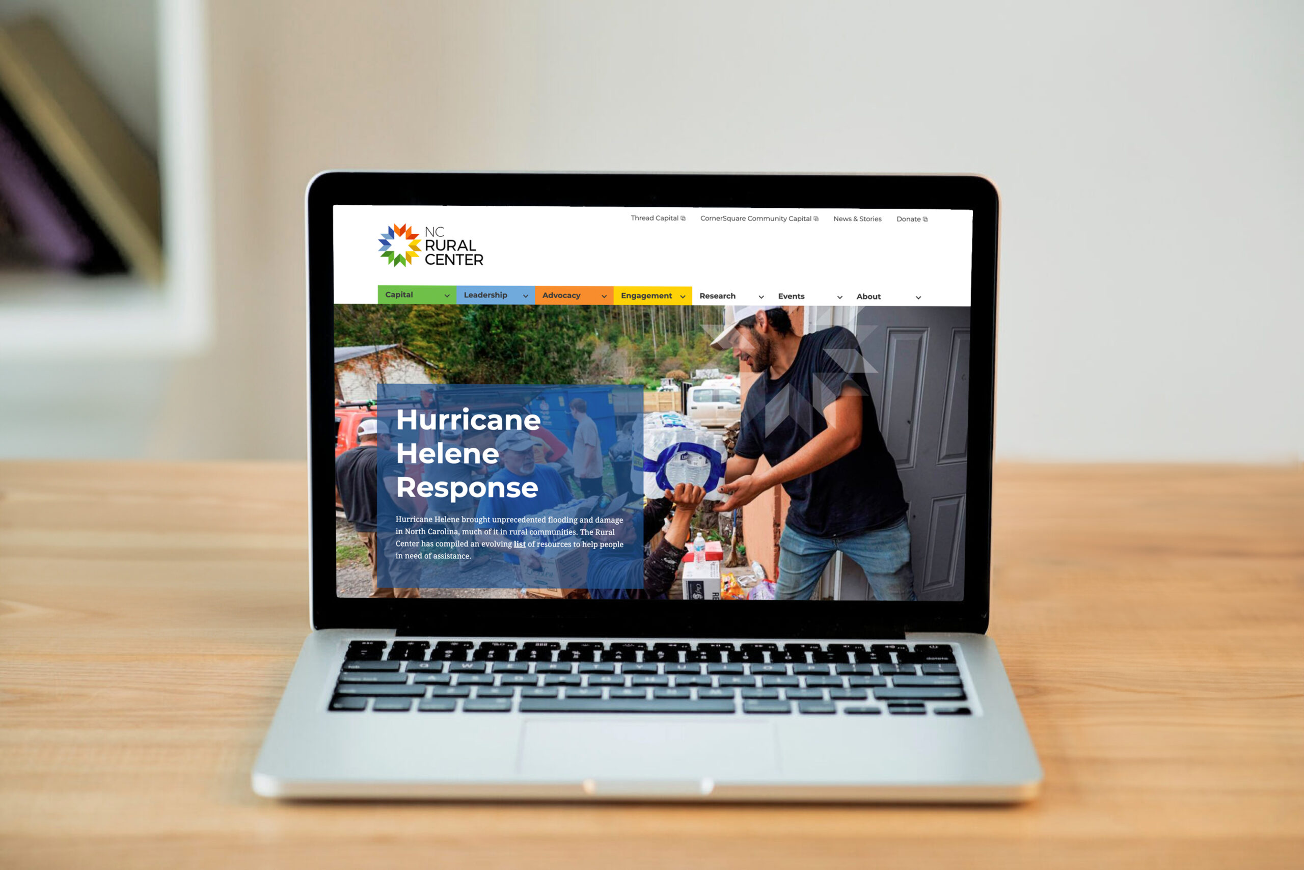
One of the agency’s long-standing clients. Beginning with the identity, the relationship lasted over seven years, with designs, development, strategizing, and support for the non-profit to meet its mission of improving the quality of life of rural North Carolinians.
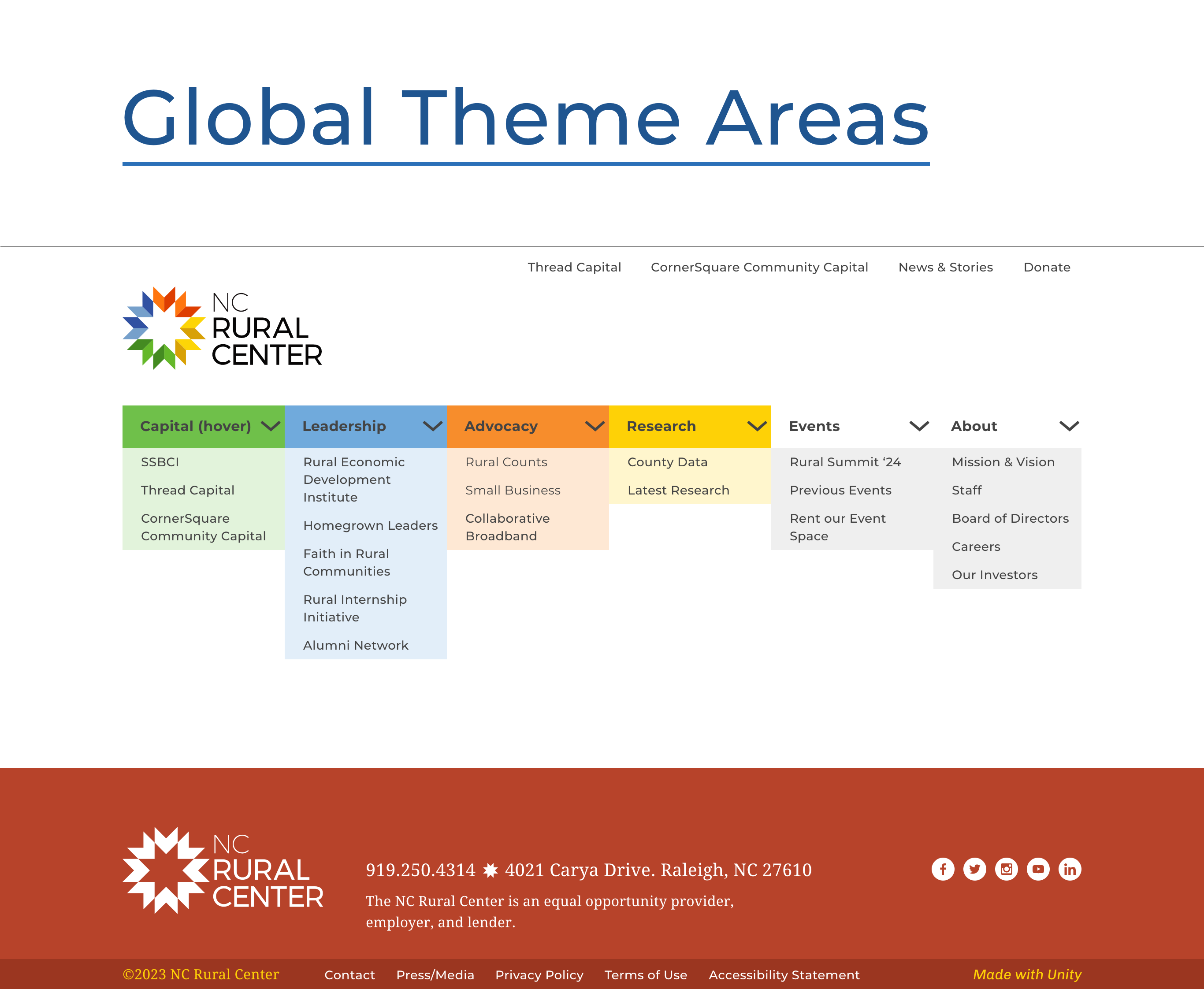
This latest iteration was to design and develop the website so the NCRC teams could easily update and manage it. Design phases included IA, UX/UI, and wiremapping, where sitemaps and wireframes were blended to enable a fluid timeline, conversations, and quicker consensus with the leadership team.
About the Client
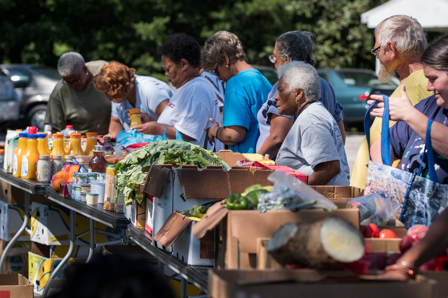
The NC Rural Center’s mission is to develop, promote, and implement sound economic strategies to improve the quality of life of rural North Carolinians.
Since 1987, the Rural Center has worked to improve the quality of life for the state’s rural people and places. Operating with the core belief that our rural communities have inherent cultural value and are vital to the overall economic health of our state, recognizing that the changing landscape of rural North Carolina brings with it significant challenges also believing in the resiliency of our state’s rural people and their dedicated stewardship of the communities they call home.

Information Architecture
The client team kick-off meeting provided clarity on pain points, visitor activity, and new goals for the new site:
Discovery
- Recommendations on site structure and content organization:
- content to be more timely, dynamic, informative, and inviting
- Integrate one sign-in to manage 4 organizational sites.
- Refresh the brand use across the site.
- Integrate an easier and more understandable page builder.
- Easy to navigate
- Empower client teams to update the site.
- To be the resource for the NC rural community.
- Spanish translation
Design
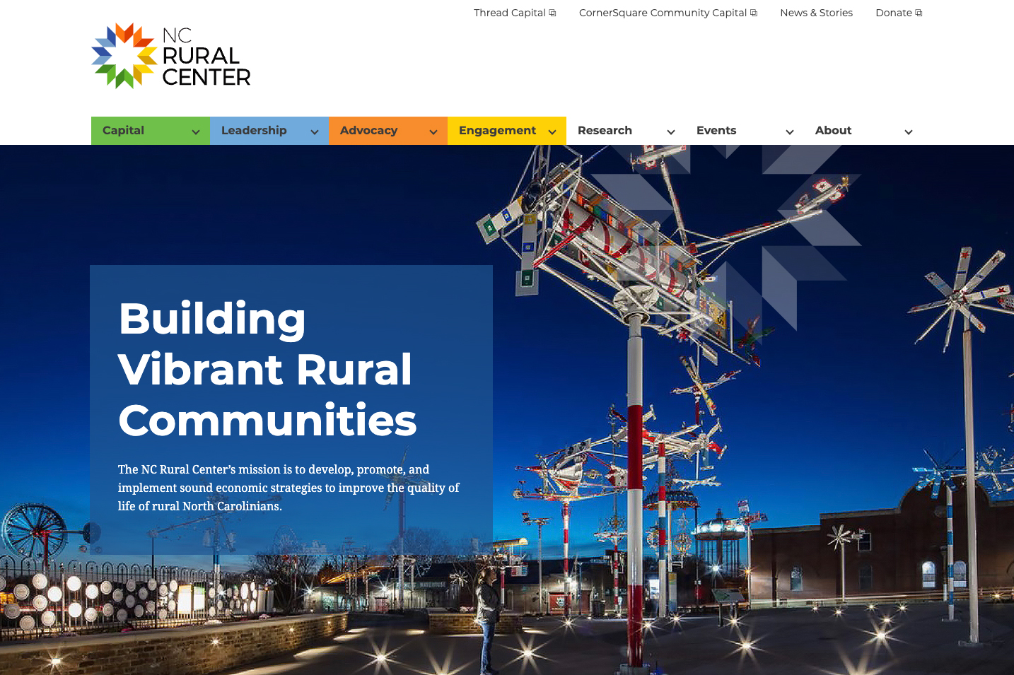
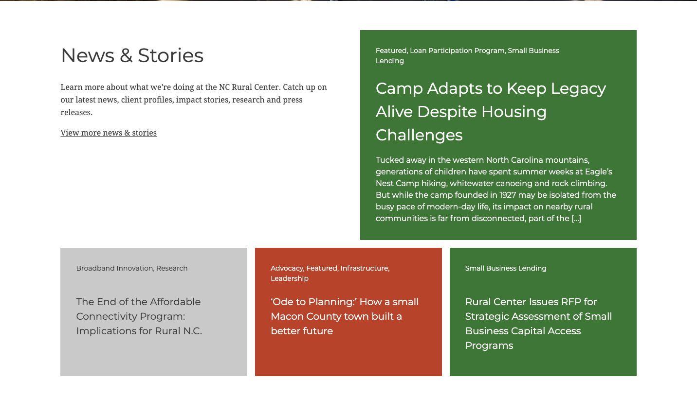
The approach revitalized the design by making it easier to manage, establishing a systematic structure for components, and creating a comprehensive framework that integrates the brand more effectively across the site. It clarified the typographic hierarchy, modernized the overall look and feel, and focused on delivering more engaging, streamlined content on the homepage.
Montserrat is an excellent font for legibility and accessibility due to its geometric sans-serif design, balanced shapes, consistent stroke widths, and large x-height improves readability.
Adding value to the brand color palette enhances accessibility by ensuring designs accommodate a wider range of users. Adjusting color properties, such as brightness, contrast, and saturation, improved readability and usability, especially for key elements like text, buttons, and links.

78 County Data Pages
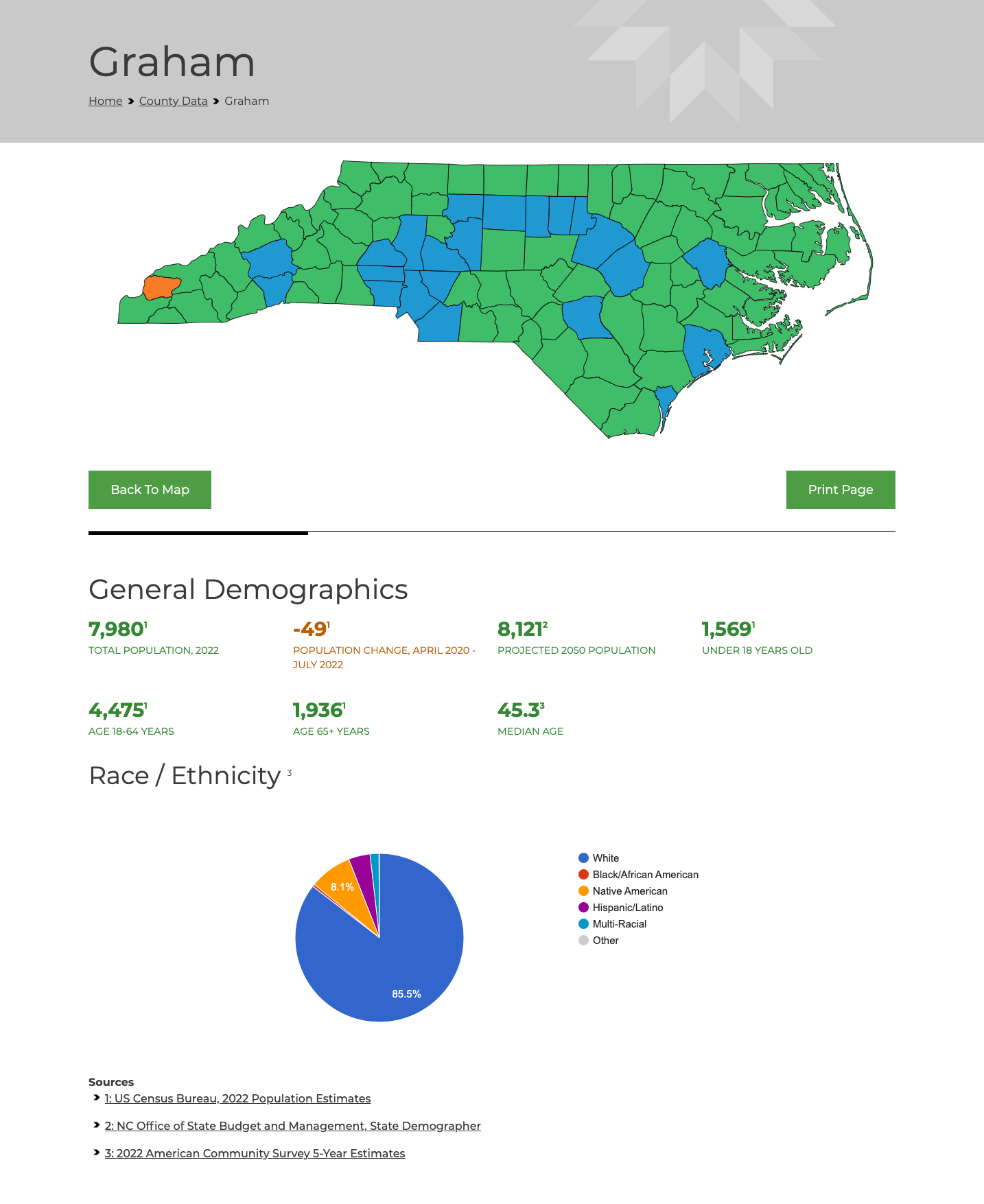
The page shows Graham County, one of 78 rural counties, illustrating an in-depth look at county data focusing on its demographics, economic conditions, education levels, employment statistics, health data, and infrastructure. It includes details about population trends, income, housing costs, graduation rates, workforce participation, and healthcare access. The information highlights challenges and opportunities for development in the county.
Homepage
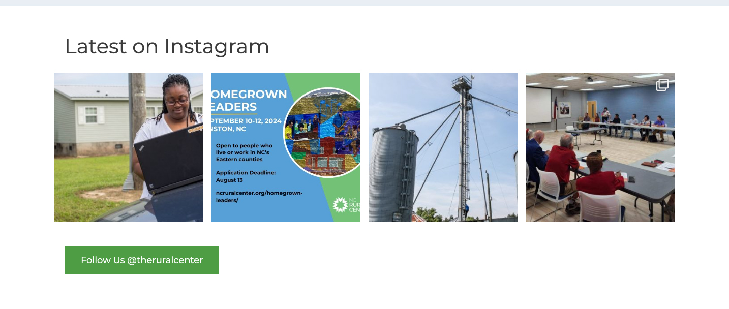
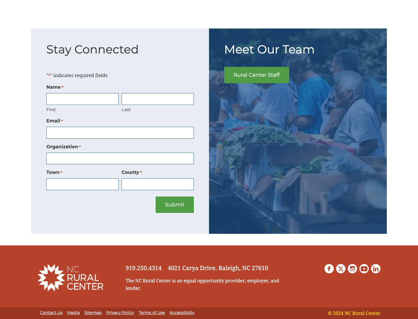
The new look successfully gave the client team a fresh site making it modern, flexible, and integrated with its communication strategies while increasing user experience and satisfaction.
