Research Triangle Regional Partnership
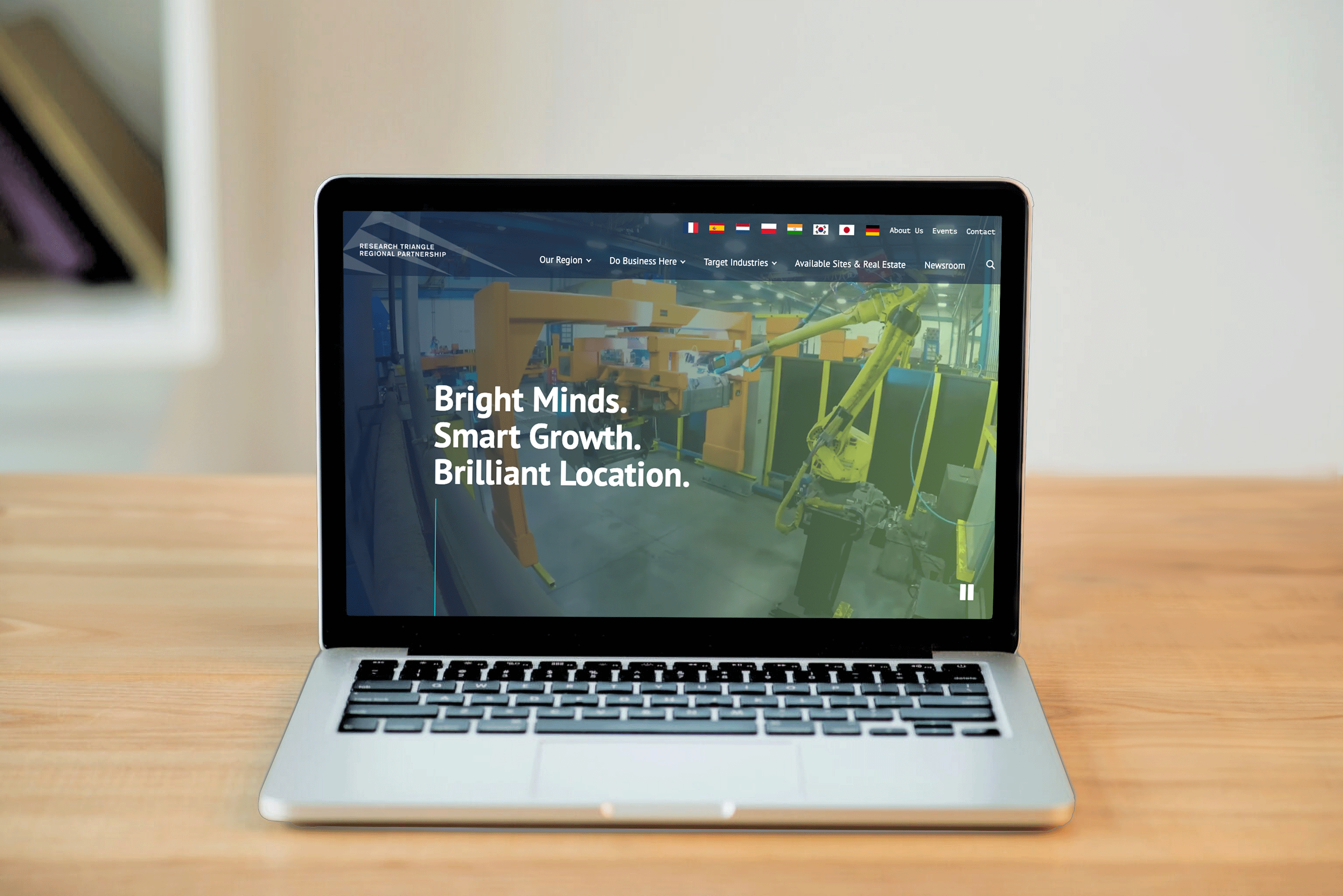
A revitalized vision for the Research Triangle Regional Partnership website a Webby Award Honoree, the first industry recognition for the Agency.

“A professional site to demonstrate the Triangle is the best place to live and do business in the world shown with data and stories.”
Design Sprints
The Research Triangle Regional Partners desire a modern site that is easy to use and has a functional purpose — “cut through the BS and get to the information, no fluff”— clean, sleek, efficient, elevated, professional, and current.
Concept boards effectively communicated the 3 overarching visual and thematic directions and provided talking points for the client team.
Juxtaposing imagery, colors, textures, and branding elements inspired creativity. Served as discussion points helping to align visual aesthetics between the client and the agency. The dialog established a visual language that guided design decisions, ensuring consistency in style, tone, and aesthetics throughout the project.
Concept Boards


Homepage


