RTP Impact Reports
Website
The Research Triangle Foundation supports the growth and innovation of the Research Triangle Park (RTP). The three Impact Reports showcase its contributions and achievements and communicate measurable outcomes such as economic growth, community engagement, and advancements in technology and education. The Impact Report promotes transparency, accountability, and stakeholder support for RTP’s ongoing mission by detailing successes and future goals.
Design Strategy
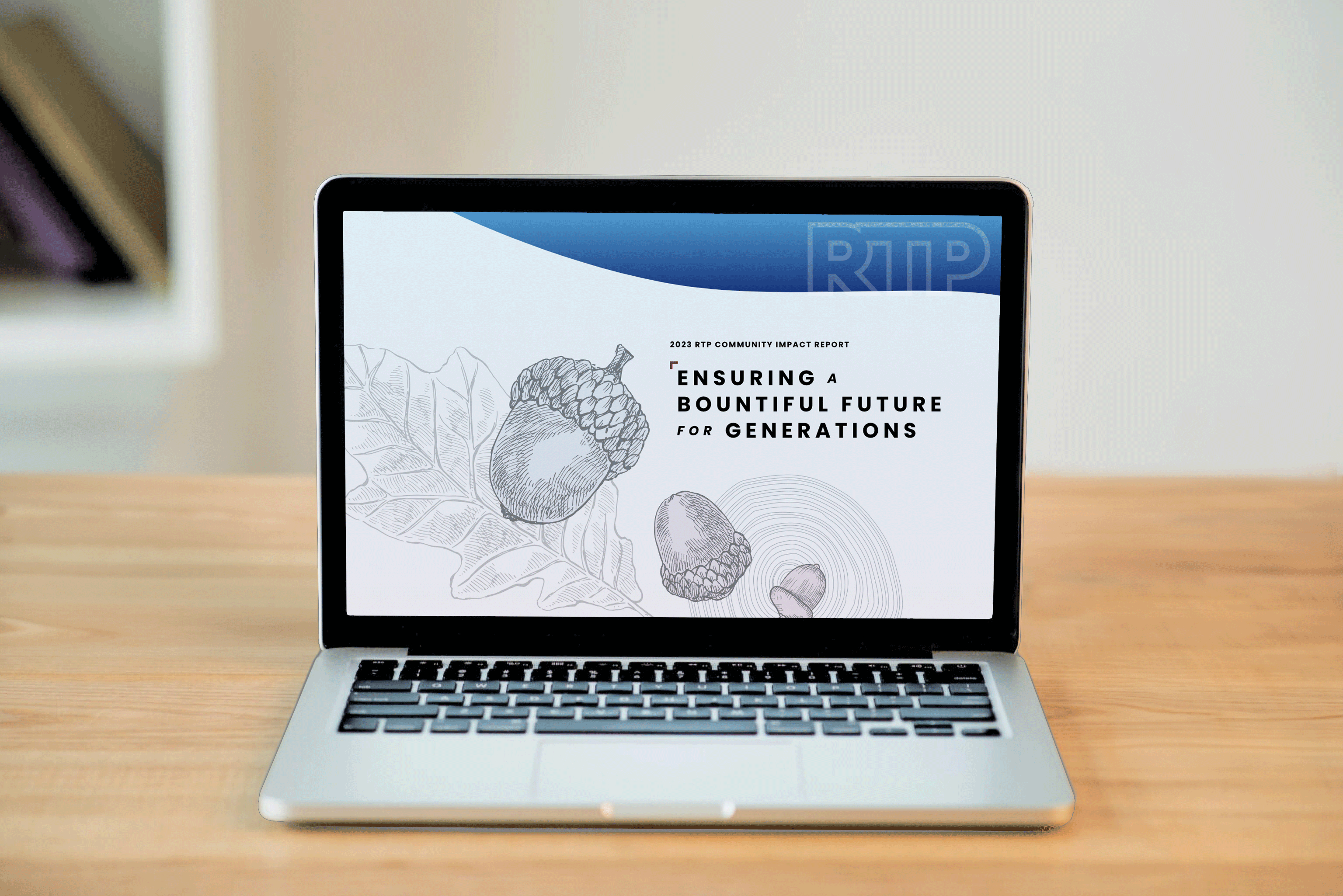
The 2023 RTP Impact Report webpage prioritizes clarity, engagement, and accessibility. Using the Poppins typeface establishes a clear hierarchy for readability.
Vibrant, brand-aligned colors and contrasting tones emphasize key data and call to action, while dynamic visuals like infographics, photography, and artwork highlight achievements.

A modular, scroll-friendly layout organizes content by themes such as innovation and community impact, with intuitive navigation. The design is mobile-responsive and WCAG-compliant for inclusivity across devices.
Visit the 2023 RTP Community Impact ReportTheme Sprint
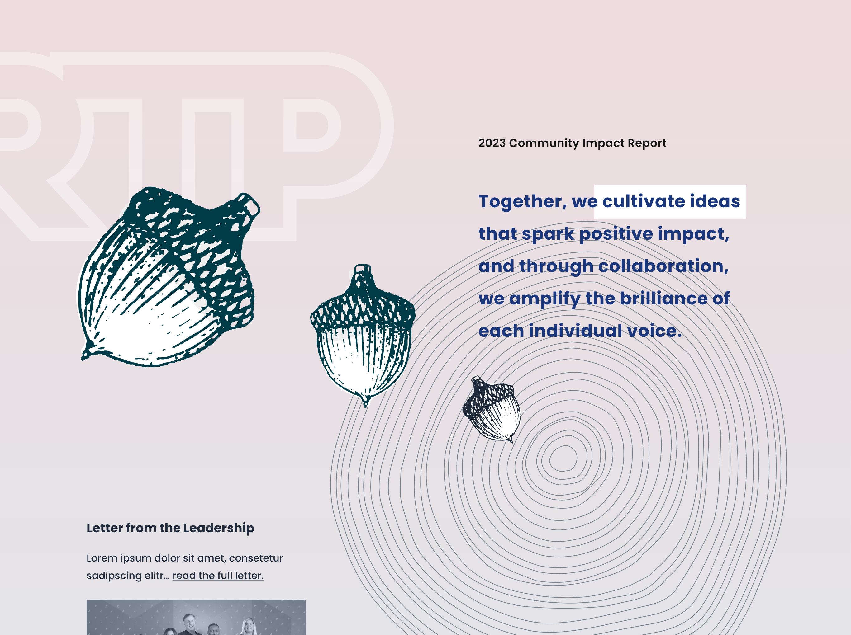
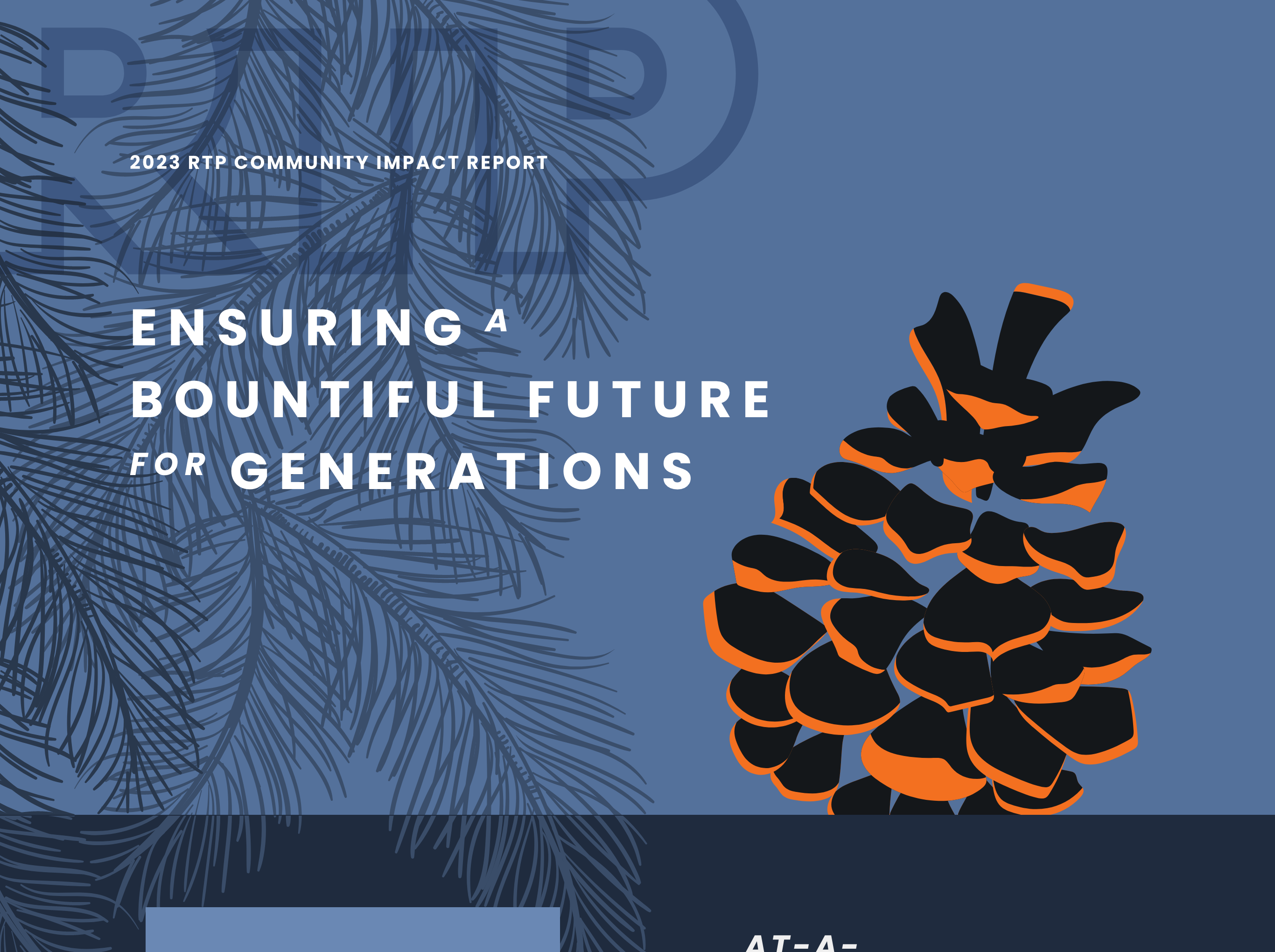
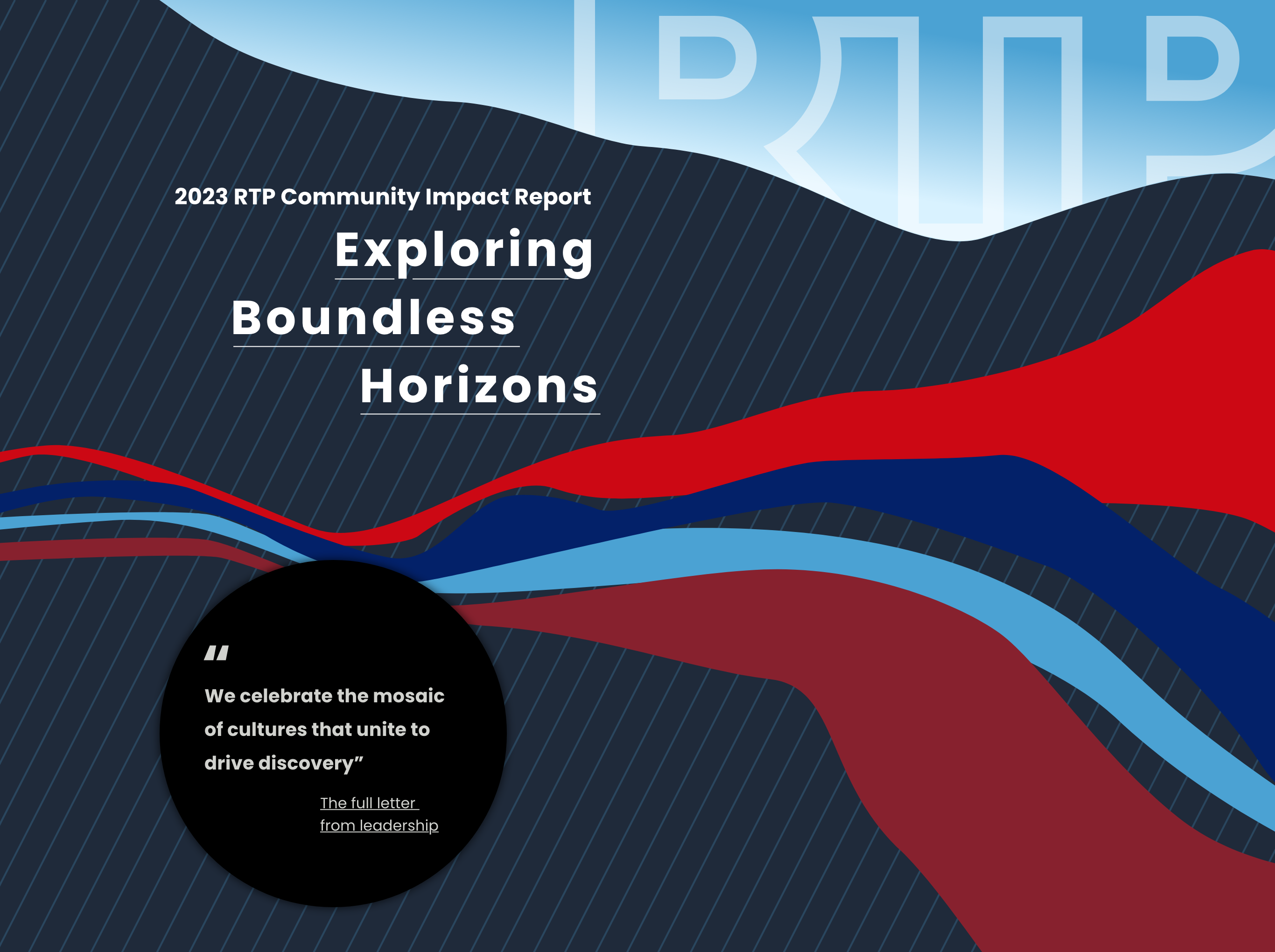
Themes explored Bountiful, Nature, and Boundless inspired three distinct visual concepts. Through collaborative discussions on color, typography, imagery, and messaging—clarified content and client aesthetics—achieving stakeholder alignment on the visual direction.
Design Strategy
Anticipating a 50% population increase by 2025, the Research Triangle Foundation aimed to transform RTP into a more integrated community, key priorities included improved transportation, housing, education, and infrastructure while preserving the region’s environment, amenities, and appeal. The Impact Report highlights features to attract families as the best destination in the United States to work, live, and play.
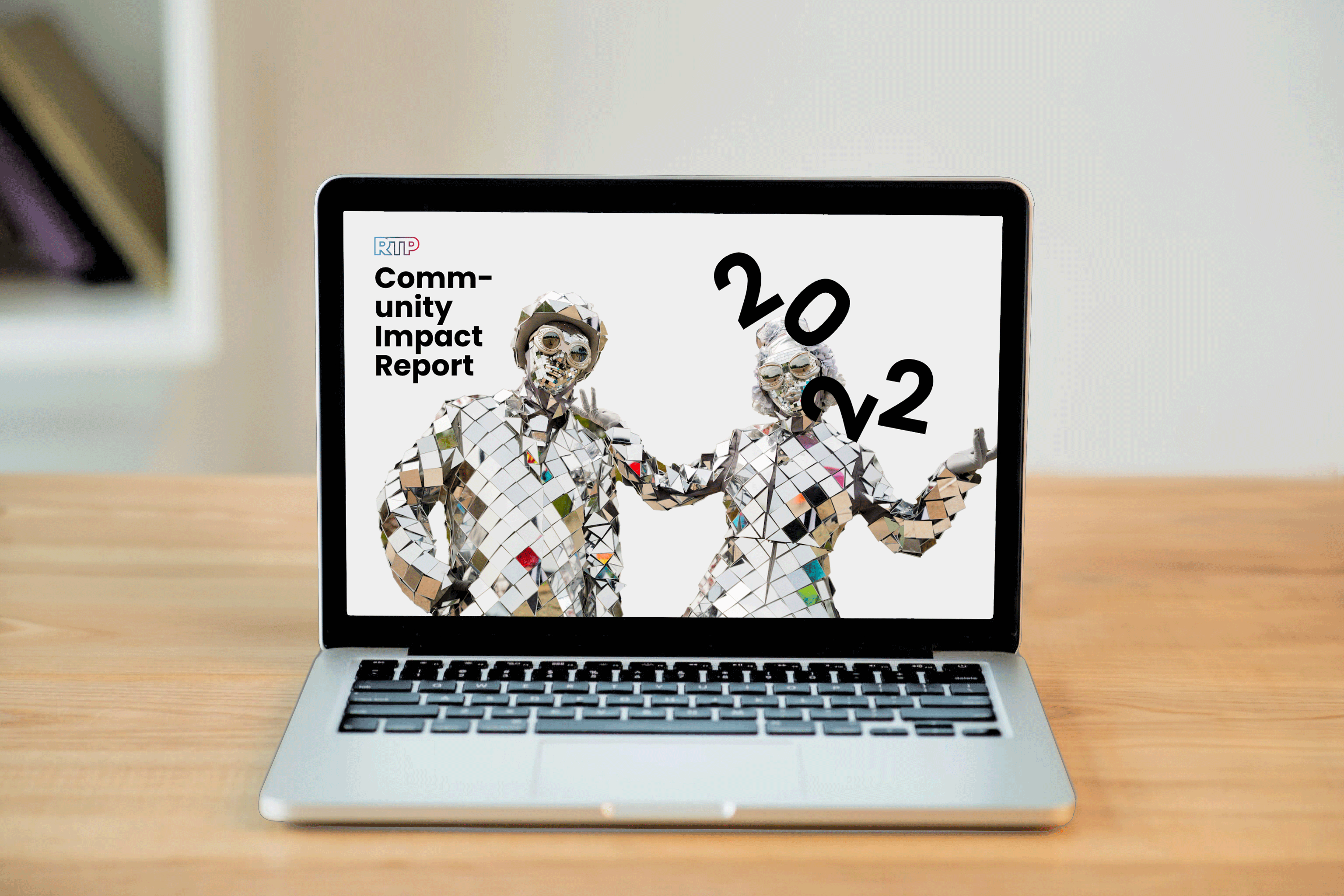
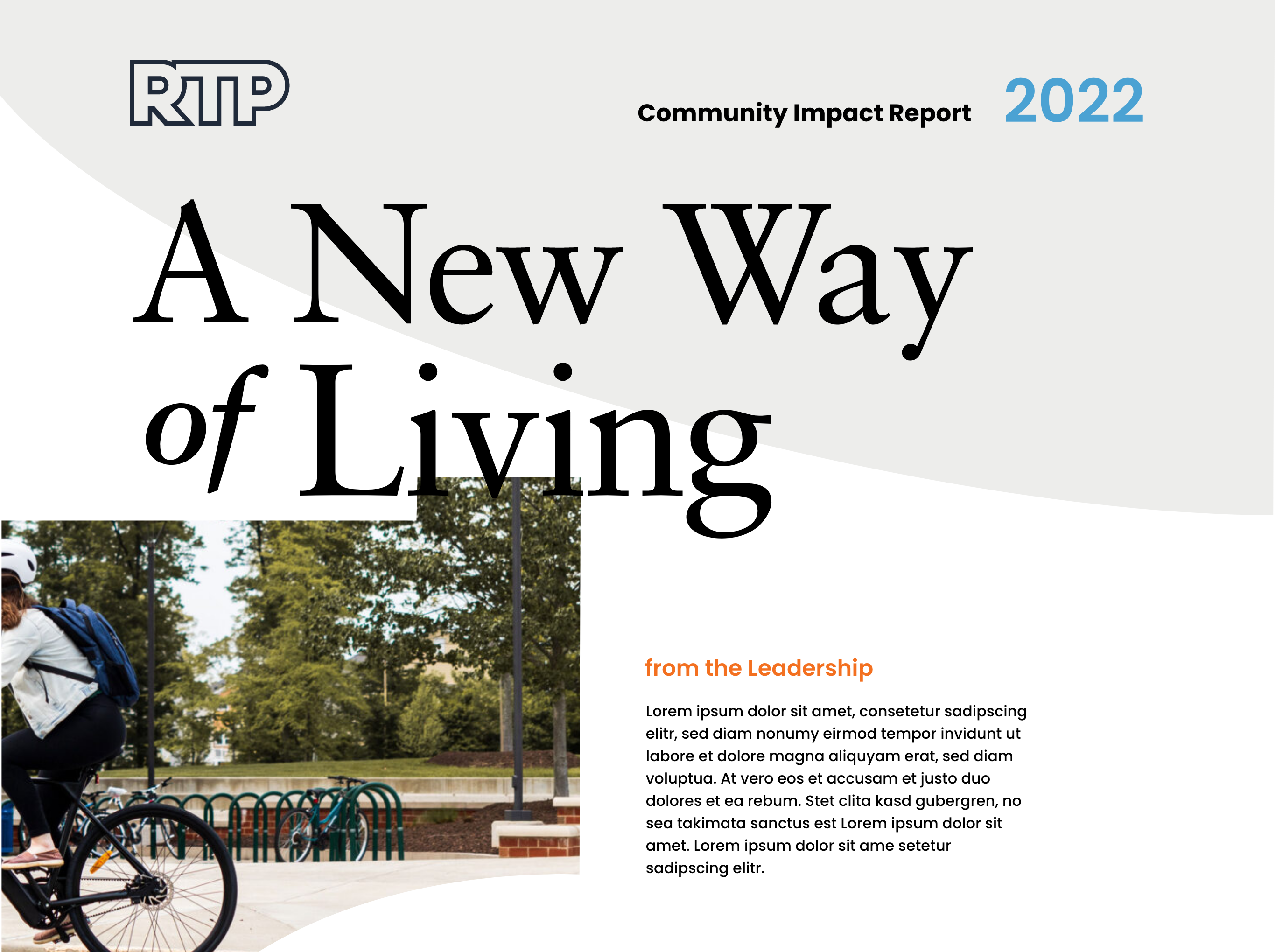
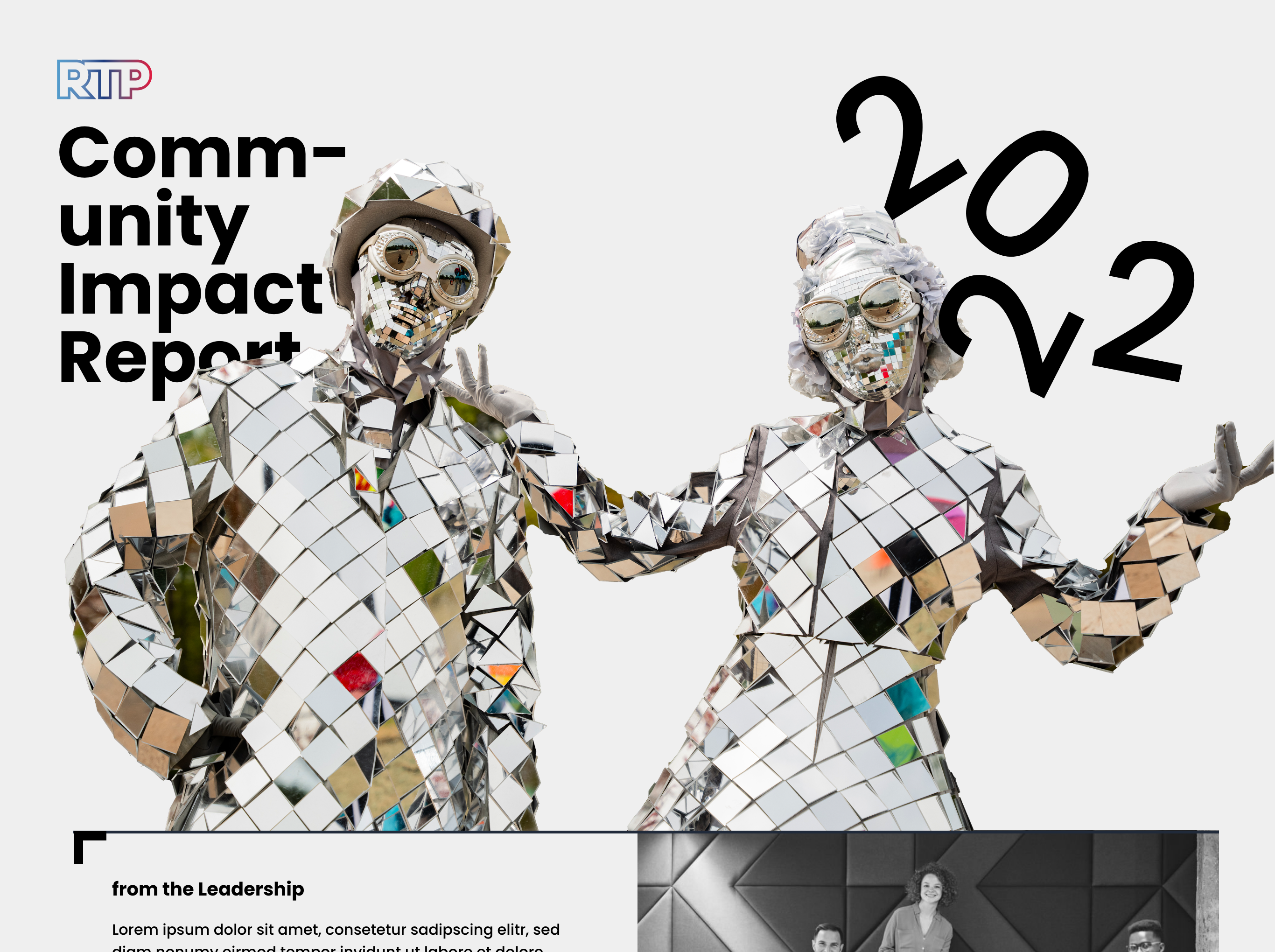
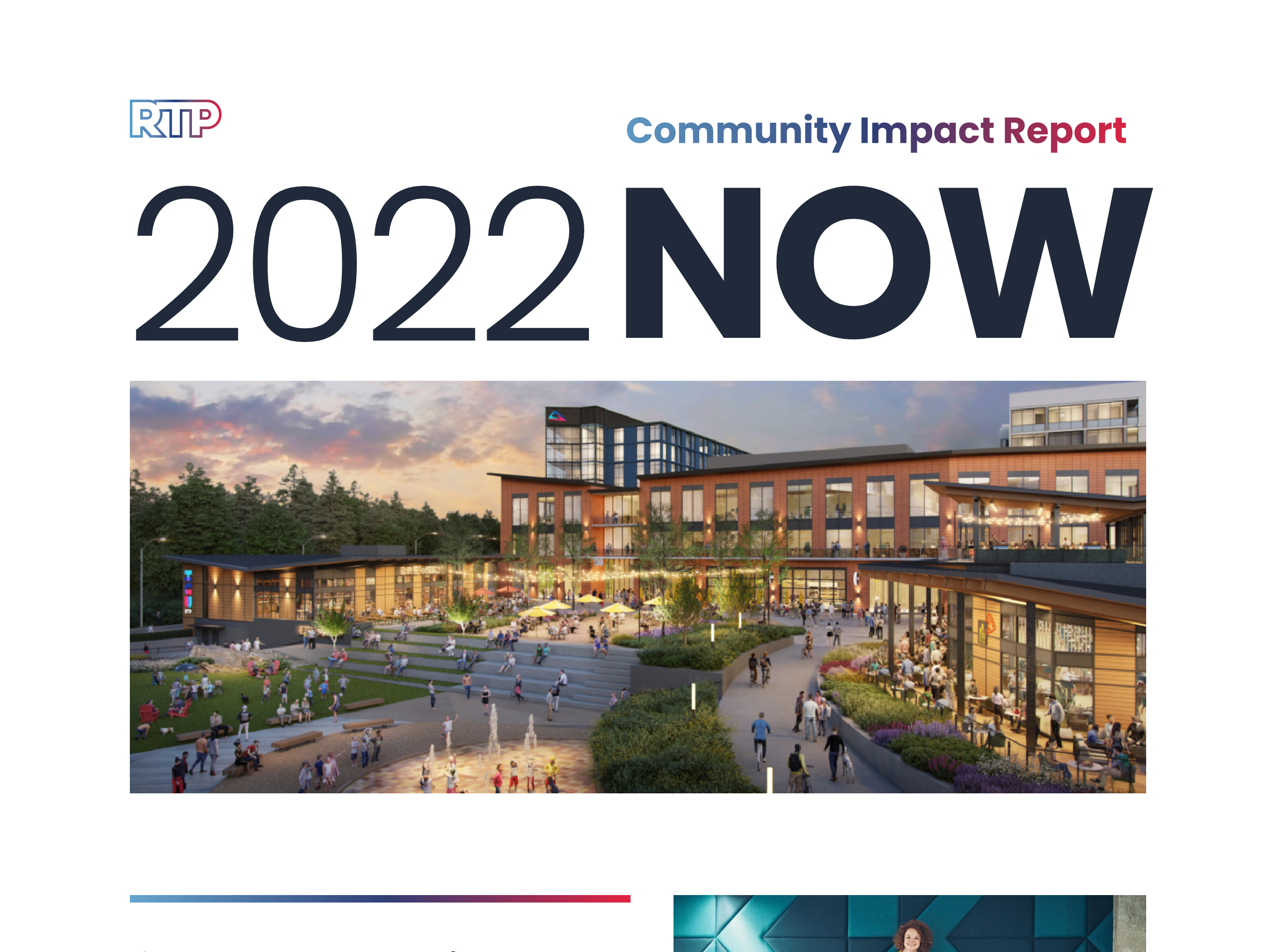
The 2022 RTP Impact Report webpage features a modern layout with a hero portrait of local artists. A consistent grid, strategic whitespace, and bold colors enhance readability. Poppins font, infographics, and photography highlight key metrics, real estate developments, and authentic stories in an engaging, visually dynamic design.
2022 RTP Community Impact ReportTheme Sprint
Guided by the brand-aligned elements, the themes Ignite Imagination, Nurture Nature’s Gifts, and Explore Boundless Horizons inspired three distinct visual concepts. Through collaborative discussions on color, typography, imagery, and messaging—clarified content organization and client aesthetics—achieving stakeholder alignment on the visual direction.
Design Strategy
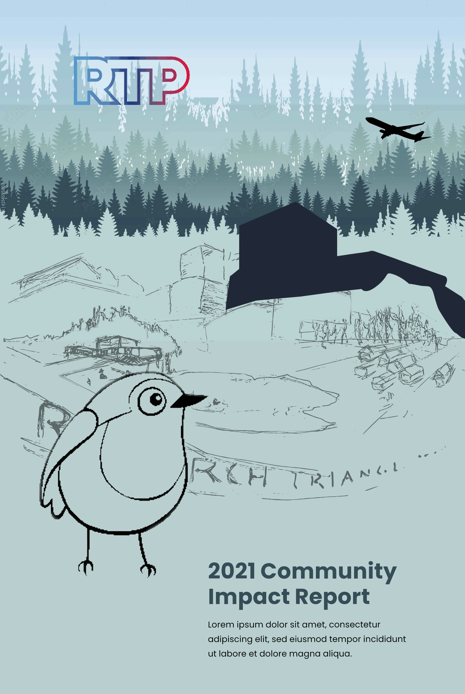
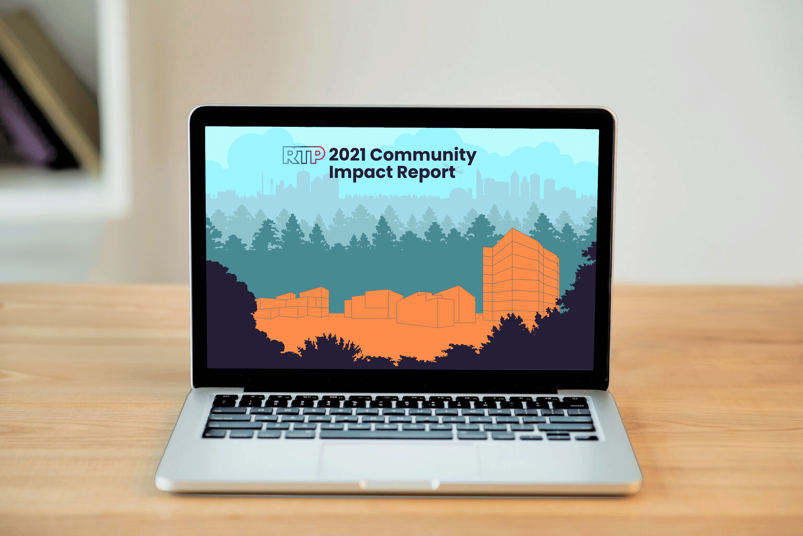
The 2021 RTP Impact Report site features a clean, structured layout that effectively engages users through balance, flow, alignment, and contrast. This year’s report introduces a whimsical touch: a parallax animation in the hero section, with the illustration set against a 7,000-acre green backdrop. Artie, the site’s virtual docent, guides visitors through key headlines about the park.
Simple cards with vibrant colors, photographic overlays, and compelling headlines allow users to navigate seamlessly to the next feature topics: Community, Industry, and Diversity, Equity, and Inclusion.
Visit the 2021 RTP Community Impact Report
“During a time of uncertainty for many businesses, organizations including Apple, Eli Lilly, Duke University, Fidelity Investments, and Toshiba initiated or expanded investments in RTP, adding jobs, square footage, or both.”
Typography
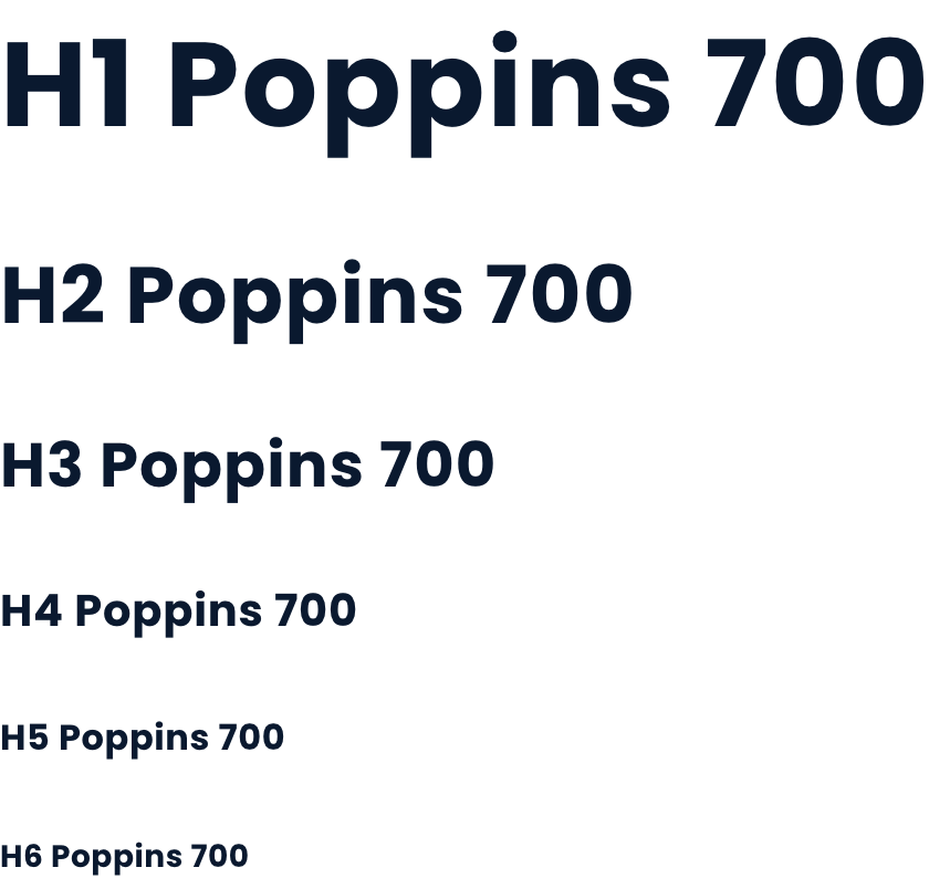
Poppins’ geometric sans-serif design, monolinear strokes, and generous spacing ensure high readability, even at small sizes or low resolutions. Its broad language support and balanced x-height make it ideal for accessible, inclusive digital and print designs.
Color Scheme
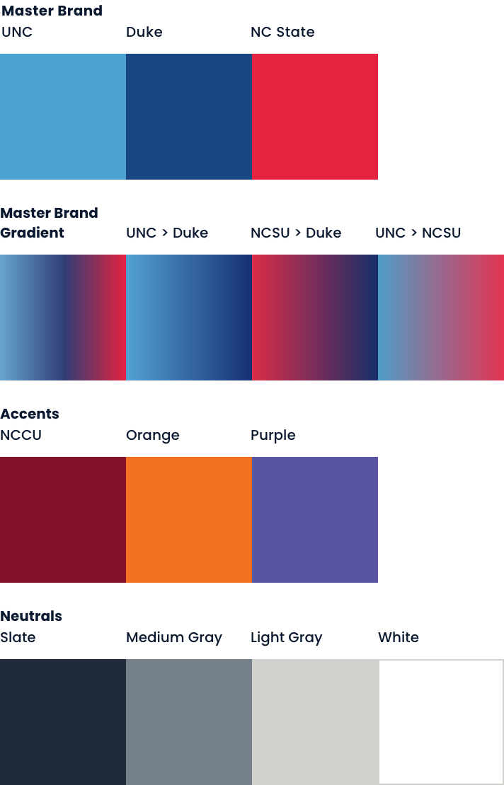
Research Triangle Park (RTP) is uniquely situated at the geographic center of three Tier-1 research universities: Duke University, UNC-Chapel Hill, and NC State. This central location inspires RTP’s primary color palette, which reflects the brand colors of these institutions.
Theme Sprint
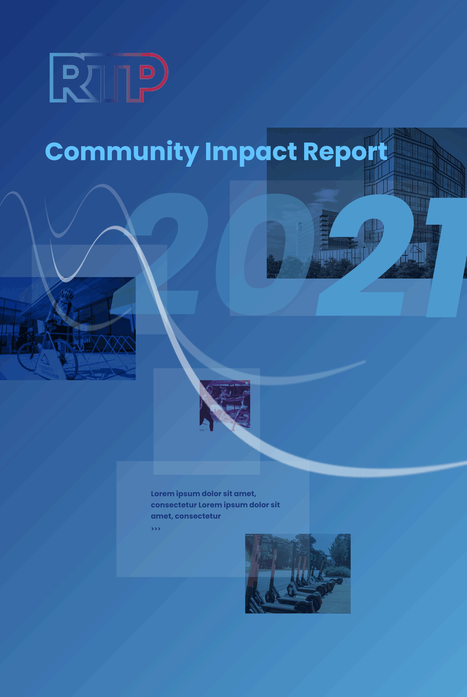
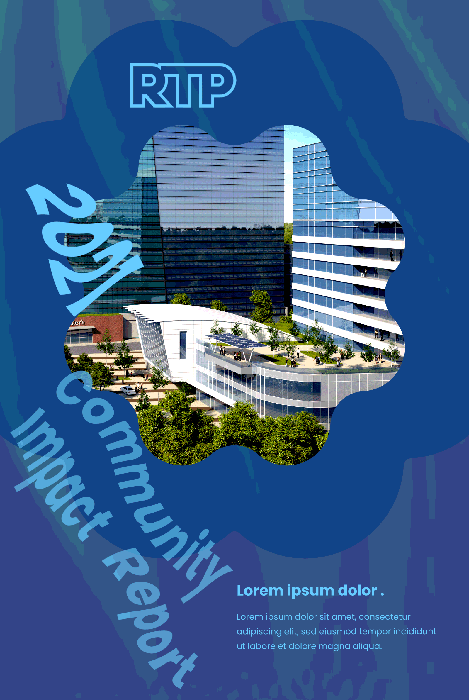
2021 was a transformative year for RTP, bringing change and hope to the heart of the park. This pivotal year introduced creative themes of Expansion, Community, and Opening—highlighting growth, resilience, and economic impact for Research Triangle Park and North Carolina. Collaborative efforts refined color, typography, imagery, and messaging, enhancing content organization and aligning client aesthetics. These discussions achieved a unified visual direction and strengthened stakeholder alignment.
