SeeBeyond
Brand Identity
Print
SeeBeyond, a global technology integration software company, needed a brand identity that effectively represented its innovation and seamless connectivity. The solution was a dynamic visual system that went beyond just the logo, incorporating sculptural forms, textured patterns, and typography inspired by the company’s core technology.
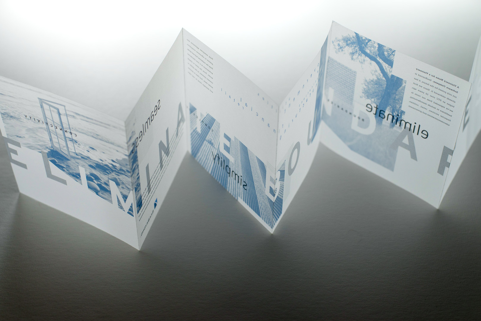
Vellum Mailer
To launch the rebranding, a sleek accordion-style mailer was designed, featuring a color palette of silver and blue to evoke transparency and limitless possibilities. This mailer was encased in a vellum envelope, making a striking first impression on the technology community.
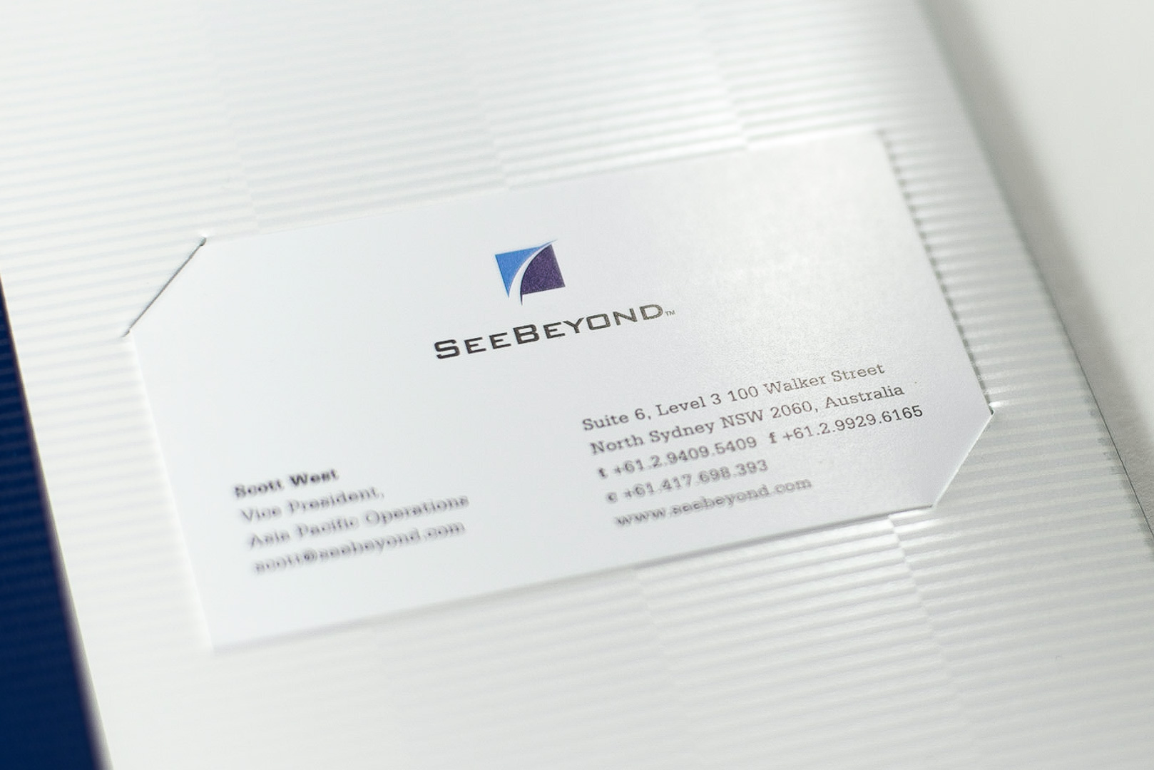
Folder
A premium tri-fold folder reinforced the brand identity. It included four spot colors, die-cut business card slots, and a textured pocket with tinted varnish, all designed to convey sophistication and technological precision.

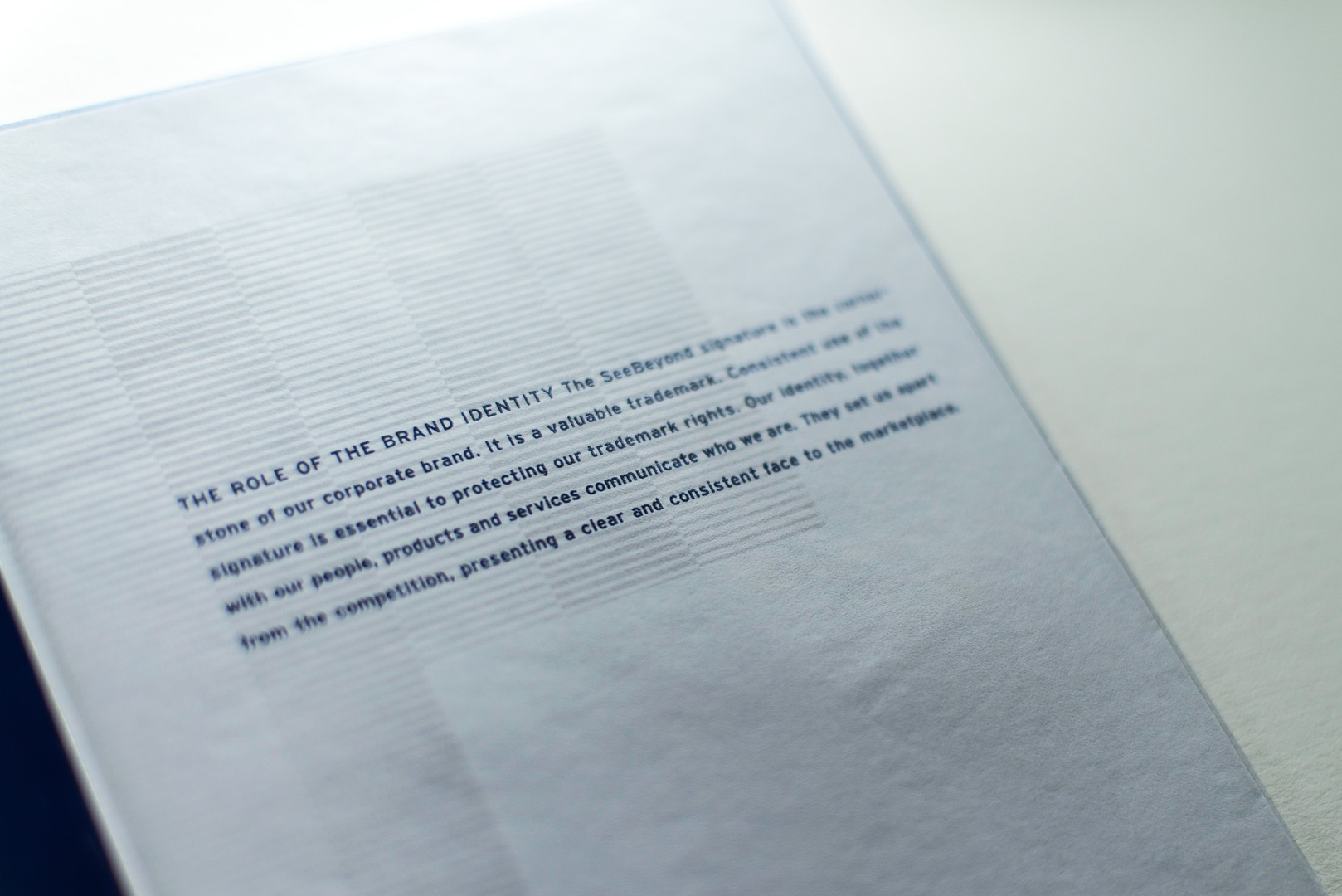
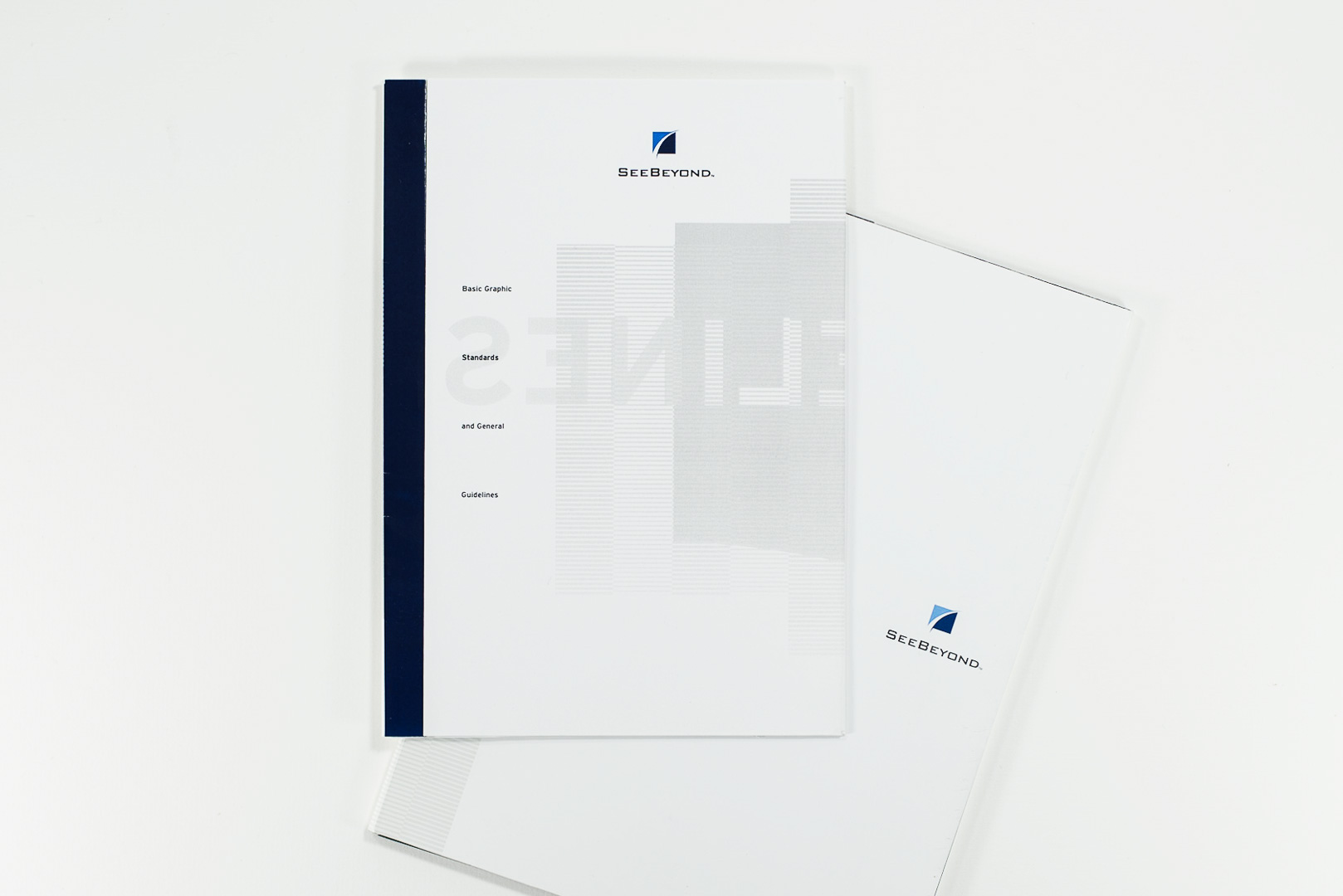
Basic Guidelines
A concise in-house guide ensured brand consistency, covering logo usage, clear space, reproduction sizing, color palette, and typography standards.